# Native Experience editor
Use the Native Experience editor to build Scenes in the Scene composer.
# Native Experience editor
> Use the Native Experience editor to add content to your Scene and determine appearance and behaviors.
The Native Experience editor is the built-in editor when [creating a Scene](https://www.airship.com/docs/guides/messaging/in-app-experiences/scenes/create/). It supports configuring appearance, behavior, and [Branching](https://www.airship.com/docs/reference/glossary/#branching).
## Configuration workflow
The following is the general workflow for configuring the Content step of a Scene:
1. Select the gear icon () in the left sidebar to configure behavioral settings that apply to the entire Scene. Follow the steps in [Scene behaviors](https://www.airship.com/docs/guides/messaging/editors/native/behaviors/).
1. Select the file icon () in the left sidebar to configure the appearance of your screens. Follow the steps in [Root appearance](https://www.airship.com/docs/guides/messaging/editors/native/root/) for settings that apply to all screens. For your screen content, you can choose any option:
* [Provide custom HTML](#provide-custom-html)
* Manually [Configure screens](https://www.airship.com/docs/guides/messaging/editors/native/screens/)
* [Create AI-generated screens](#create-ai-generated-screens)
*Configuring screens in a Scene*
1. (Optional) Select the branching icon () to create a custom user path through the screens. See [Scene branching](https://www.airship.com/docs/guides/messaging/editors/native/branching/).
1. (Optional) Select the accessibility audit icon () in the left sidebar to review and address accessibility issues in your Scene. See [Accessibility agent](#accessibility-agent).
1. After completing configuration, select **Done**. You will then see a collapsed view of the screens. Select the arrows to page through each screen. Select **Expand
** to see the screens side by side. The [preview tools](#preview-tools) there are the same as when configuring content.
### Preview tools
The device preview updates as you type and make selections. Use the tools in the header to adjust the preview.

*Preview tools in the Scene composer*
Available tools:
| Tool | Description | Steps |
| --- | --- | --- |
| **App/Web format** | This tool displays the Scene as it will appear in an app or website. The buttons only appear when both App and Web are enabled. See [Audience](https://www.airship.com/docs/guides/messaging/in-app-experiences/scenes/create/#audience) in _Create a Scene_. | Select the grid icon for App or the globe icon for Web. |
| **Orientation** | This tool shows how the Scene will appear when the device or monitor is rotated. | Toggle the orientation icon. |
| **Light/Dark mode** | This tool shows the appearance of elements with an assigned [Color Set](https://www.airship.com/docs/reference/glossary/#color_set). Light Mode values appear in Dark Mode preview if no Dark Mode value was entered for a color set. | Toggle the selector. |
| **Text scaling** | This tool shows how the content will appear on devices using text size accessibility features. Scale between 70% and 200% of the current text size. | Select the text scale tool and set a scale. |
| **Device/Screen size** | This tool provides a more accurate representation of how your content will appear on a specific screen size. | Select a device or screen size. |
| **Interactive mode** | This tool enables testing the interactive elements of your Scene with all configuration panels hidden. You can swipe between screens or select buttons or other elements configured with Next or Previous actions. When [Story](https://www.airship.com/docs/reference/glossary/#story) mode is enabled, select the play icon (
) or pause icon (
) to test automatic screen transitions and background video playback. | Select the eye icon () to enter Interactive mode, then test your Scene. Select the reload icon to reset and return to the first screen. |
| **Preview Data** | For [personalized content](https://www.airship.com/docs/guides/personalization/about/), this tool displays the values for a selected user or your own JSON sample data. Otherwise, the preview displays the default values. See [Previewing personalized content](https://www.airship.com/docs/guides/personalization/previewing/). | Follow the steps in [Previewing personalized content](https://www.airship.com/docs/guides/personalization/previewing/). |
> **Tip:** For best results, always test your content on actual devices.
### Accessibility agent
[Agentic & Generative AI](https://www.airship.com/docs/guides/features/intelligence-ai/ai/)
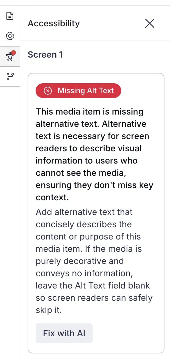
*The accessibility agent showing an issue*
The accessibility agent automatically audits your content and identifies potential accessibility issues, such as insufficient color contrast, missing alternative text, and text size that falls below recommend minimums. Addressing these issues helps ensure your content is usable by the greatest number of audience members, including those with disabilities.
While editing screens, when an accessibility issue is found, a red dot appears on the accessibility audit icon () in the left sidebar. Select the icon to view the list of flagged issues. Each issue includes:
* A description of the problem
* The screen and element where it occurs
* Guidance on how to address it
* A button labeled with the recommended correction — *AI-powered corrections are labeled "Fix with AI"*
Select the button to apply the correction, and then verify each automatically applied fix to ensure it meets your needs and maintains your intended messaging.
You are responsible for reviewing all automatically applied fixes before launching your Scene. Automated fixes may not always align with your specific content requirements or brand guidelines. For comprehensive accessibility guidance and best practices, see [Accessibility in messaging](https://www.airship.com/docs/guides/messaging/accessibility-in-messaging/).
The following issues can be automatically fixed:
| Issue type | Description |
| --- | --- |
| **Insufficient color contrast** | These are color contrast ratio issues between content elements, such as indicator colors versus background colors. The agent presents issues for both light and dark modes. The fix adjusts colors to meet WCAG contrast ratio requirements. |
| **Text not marked as heading** | These are text items that visually appear to be headings, such as bold or larger font, but are not marked with a semantic H1-H6 tag. The fix applies an appropriate heading level based on the text's position and styling. |
| **No headings in screen** | This flags content if no Text elements are designated as headings (H1-H6). The fix suggests appropriate heading levels for Text elements that appear to be headings. |
| **Heading order** | This identifies and recommends fixes for out-of-order heading structure. The fix adjusts heading levels to create a logical hierarchy. |
| **Text size below minimum** | This is text that does not meet minimum readability recommendations. The fix adjusts the font size to meet accessibility standards. |
| **Images containing text** | This is any image that contains text, which screen readers cannot interpret. The fix adds or updates the alternative text field to describe the text within the image. |
| **Missing alternative text** | This is any image that lacks descriptive alternative text. The fix uses AI to generate descriptive alternative text for the image. |
| **Missing content descriptions or accessibility label associations on inputs** | These are input fields that lack content descriptions or accessibility label associations. The fix uses AI to generate content descriptions. For accessibility labels, the fix always generates a content description but does not suggest label relationships with text inputs. |
| **Missing content descriptions on buttons** | These are buttons that lack content descriptions. The fix uses AI to generate descriptive content descriptions for buttons. |
> **Note:** **Opting In to AI Functions**
>
> If you opted out of AI usage, you must sign an updated contract to enable this feature. Contact your account manager for assistance.
>
> **Compliance Considerations in Using AI Functions**
>
> The Service incorporates AI functions, including Generative AI and Agentic AI.
>
> Generative AI generates content such as Notification copy, images, and Journeys based on your prompts.
>
> Agentic AI autonomously optimizes, personalizes, or executes cross-channel customer engagement actions, or analyzes audience and performance data, subject to the parameters and controls you set in the Service. These systems operate under human-defined parameters and do not initiate customer-facing actions without human interaction or pre-configured parameters. You are responsible for reviewing Generated Outputs for accuracy, appropriateness, and to ensure they do not violate third-party intellectual property or other rights. Airship does not publish Generated Outputs to end users without approval from the Customer.
>
> In addition to the applicable terms of your agreement with Airship (e.g., Use of Service, Customer Responsibilities sections), you must comply with the [Airship Acceptable Use Policy](https://www.airship.com/legal/acceptable-use/), which provides additional details about appropriate conduct when using the Service.
>
> The Service includes safety features to block harmful content, such as content that violates our Acceptable Use Policy. You may not attempt to bypass these protective measures or use content that violates your agreement with Airship.
>
> About the AI models:
>
> Airship utilizes Google Gemini and Imagen to generate copy and images for AI Scene screens. The content is created solely with Google's out-of-the-box models, and no customization or fine-tuning with Customer Data is applied. See [Responsible AI](https://cloud.google.com/responsible-ai?hl=en) in Google's *Google Cloud* documentation.
### Markdown styling
[Markdown](https://en.wikipedia.org/wiki/Markdown) is a markup language for formatting text. Scenes support basic Markdown. Use Markdown in text fields in any content element.
These styles [require minimum SDK versions](https://www.airship.com/docs/reference/messages/scene-sdk-minimums/#markdown-styling):
| Style | Syntax | Output |
|-------|--------|--------|
| **Bold** | `**Hello**` or `__Hello__` | **Hello** |
| **Italic** | `*Hello*` or `_Hello_` | *Hello* |
| **Strikethrough** | `~Hello~` | ~~Hello~~ |
| **Link**¹ | `[Hello](https://www.example.com/hello)` | [Hello](https://www.example.com/hello) |
| **Highlight** | `==Hello==` | Hello |
| **Subscript** | `H,{2},O` | H2O |
| **Superscript** | `x^^2^^` | x2 |
1 Links are not underlined and use the default link color for the platform: blue on web, unless overridden by CSS; the app's accent color on iOS; and the theme's `linkTextColor` on Android.
### Personalization
You can personalize Scene content using [Handlebars](https://www.airship.com/docs/reference/glossary/#handlebars) to display different text or media for each user. For example, you can display a question in different languages based on the user's locale Attribute. Common places to personalize include:
* Screen titles and descriptions
* Button labels
* Questions and NPS content
* Input field placeholders
* Media URLs
See [Personalization](https://www.airship.com/docs/guides/personalization/about/) for more information about using Handlebars in your content.
## Provide custom HTML
[iOS SDK 20.1+](/docs/docs/developer/sdk-integration/apple/ios-changelog/#20.1.0) [Android SDK 20.1+](/docs/docs/developer/sdk-integration/android/changelog/#20.1.0)
You can provide custom HTML for your Scenes instead of designing individual screens. After [selecting **Custom HTML** for your content](https://www.airship.com/docs/guides/messaging/in-app-experiences/scenes/create/#content), enter a publicly accessible URL. If your Airship plan includes CDN support, you also have the option to upload an HTML file.
Your HTML must be a single file containing all code. Any CSS, JavaScript, or images should be included inline or referenced via publicly accessible URLs.
Custom HTML Scenes have the following limitations:
* Native Scene features are not available, including [Branching](https://www.airship.com/docs/reference/glossary/#branching), [Story](https://www.airship.com/docs/reference/glossary/#story) mode, analytics tracking, or screen editing tools. All Scene logic, including multi-screen navigation, must be handled by your HTML and JavaScript.
* Outside of your code, the only onscreen element you can configure is the [Dismiss button](https://www.airship.com/docs/guides/messaging/editors/native/root/).
* Personalization is not supported.
## Create AI-generated screens
[Agentic & Generative AI](https://www.airship.com/docs/guides/features/intelligence-ai/ai/)
Use the Native Experience AI Agent to create and refine screens through a conversational chat interface. Generate individual screens or multi-screen experiences from a prompt or by uploading a mockup or wireframe. Modify your current screens by asking for edits or new content and images.
The agent supports the following capabilities:
* **Conversational editing and refinement** — Use natural language to iterate on designs. Request quick edits such as "Align the button to the left" or "Move my image below the heading," as well as more extensive edits and additions.
* **Brand and style integration** — Provide feedback to match the styles in your [brand guidelines](https://www.airship.com/docs/guides/messaging/features/brand-guidelines/), such as "Make the button use my 'Primary' button style" or "Change the background to 'Secondary'."
* **Design capabilities** — The agent handles button actions, borders, corner radius, and color matching to ensure accurate and functional output, giving you creative control when using AI to design Scenes.
* **Image generation** — Generate original images directly based on a prompt or the Scene's purpose.
Using the agent provides significant advantages, directly addressing common challenges in design and development:
* **Effortless recreation of complex designs** — AI streamlines the process of bringing intricate designs from static images or wireframes to life, aiding in accuracy and consistency.
* **Automated implementation** — AI handles the grunt work of configuring content elements, matching design layouts, styles, and interactive components.
* **Accelerated time to value** — By automating the screen generation process, AI drastically speeds up campaign development, enhancing agility and getting your projects to market faster.
You can use the agent when editing screens:
1. Select ** Native Experience AI Agent**.
1. Enter text describing your desired screen and/or select the upload icon () and choose a file. When uploading files:
* Supported file formats: PNG, JPG, JPEG, GIF, and SVG.
* The generated content attempts to recreate the uploaded file's content.
* If the text and buttons in the files match the styles in your [brand guidelines](https://www.airship.com/docs/guides/messaging/features/brand-guidelines/), those styles will be applied. Otherwise, the system will try to match the hexadecimal color values from your file.
* Explicit content is excluded.
1. Select the submit icon (
) to submit and generate the screen content.
After each generation completes, you can repeat these steps to continue editing. When you are finished using the agent, select the close icon (). Your chat history persists in the current editing session, so you can close and reopen the agent without losing your chat. Select the delete icon () to clear your chat history at any time.
When the content meets your needs, you can further refine the screens by [configuring the content elements](https://www.airship.com/docs/guides/messaging/editors/native/elements/).
> **Note:** **Opting In to AI Functions**
>
> If you opted out of AI usage, you must sign an updated contract to enable this feature. Contact your account manager for assistance.
>
> **Compliance Considerations in Using AI Functions**
>
> The Service incorporates AI functions, including Generative AI and Agentic AI.
>
> Generative AI generates content such as Notification copy, images, and Journeys based on your prompts.
>
> Agentic AI autonomously optimizes, personalizes, or executes cross-channel customer engagement actions, or analyzes audience and performance data, subject to the parameters and controls you set in the Service. These systems operate under human-defined parameters and do not initiate customer-facing actions without human interaction or pre-configured parameters. You are responsible for reviewing Generated Outputs for accuracy, appropriateness, and to ensure they do not violate third-party intellectual property or other rights. Airship does not publish Generated Outputs to end users without approval from the Customer.
>
> In addition to the applicable terms of your agreement with Airship (e.g., Use of Service, Customer Responsibilities sections), you must comply with the [Airship Acceptable Use Policy](https://www.airship.com/legal/acceptable-use/), which provides additional details about appropriate conduct when using the Service.
>
> The Service includes safety features to block harmful content, such as content that violates our Acceptable Use Policy. You may not attempt to bypass these protective measures or use content that violates your agreement with Airship.
>
> About the AI models:
>
> Airship utilizes Google Gemini and Imagen to generate copy and images for AI Scene screens. The content is created solely with Google's out-of-the-box models, and no customization or fine-tuning with Customer Data is applied. See [Responsible AI](https://cloud.google.com/responsible-ai?hl=en) in Google's *Google Cloud* documentation.
# Scene behaviors
> Control how users navigate and dismiss a Scene, including swipe, story mode, and safe area settings.
These optional settings apply to the entire Scene and control how users interact with it. Configure them during the Content step when [creating a Scene](https://www.airship.com/docs/guides/messaging/in-app-experiences/scenes/create/) by selecting the gear icon () in the left sidebar.
## Close on shade tap
This setting controls whether users can close a non-fullscreen Scene by tapping the area surrounding it.
To enable the setting, check the box for **Close on shade tap**.
## Respect safe area
This setting controls whether Scene content stays within the safe area, the portion of the screen not covered by physical or UI elements like a status bar or notch. It is enabled by default.
To disable the setting, uncheck the box for **Respect safe area**. Content will extend to the full height and width of the device.
## Enable swipe
This setting controls whether users can swipe between screens in Scenes with multiple screens. It is enabled by default and cannot be enabled when Story mode is enabled.
To disable the setting, uncheck the box for **Enable swipe**. Users must interact with buttons to navigate between screens.
## Story mode
Story mode advances screens automatically without requiring swiping. For more about the feature, see [Story mode](https://www.airship.com/docs/guides/features/messaging/scenes/surveys-stories/#story-mode) in *About Scenes*.
Each screen displays for 1 to 60 seconds. When the last screen finishes, the Scene can end in one of three ways:
* **Loop** replays the Scene indefinitely
* **Display last screen** continues to display the last screen
* **Dismiss** closes the Scene
Story mode does not support scrolling, [questions](https://www.airship.com/docs/guides/messaging/editors/native/elements/#question), [NPS](https://www.airship.com/docs/guides/messaging/editors/native/elements/#nps), or [Branching](https://www.airship.com/docs/reference/glossary/#branching). The option is disabled when using custom HTML, if the Scene contains questions or NPS, or if branching is configured.
When Story mode is enabled, the [screen-level Play control for background video](https://www.airship.com/docs/guides/messaging/editors/native/screens/#video-controls) is not available. Instead, enable **Play control** when [setting the root appearance](https://www.airship.com/docs/guides/messaging/editors/native/root/) to pause or resume both Story progression and background video playback.
To enable the setting, select the add icon () for **Story mode**, then enter the number of seconds to display each screen and select an ending. To disable, select the remove icon (
).
> **Tip:** When Story mode is enabled, design screens for small device dimensions to eliminate the appearance of a non-functional scroll bar.
# Root appearance
> Configure appearance settings that apply to all screens, including dimensions, borders, shade, dismiss button, indicators, and navigation controls.
These appearance settings apply to all screens. Configure them during the Content step when [creating a Scene](https://www.airship.com/docs/guides/messaging/in-app-experiences/scenes/create/) by selecting the file icon () in the left sidebar, and then selecting **Root** from the list of screens. Configure the settings in the right sidebar.
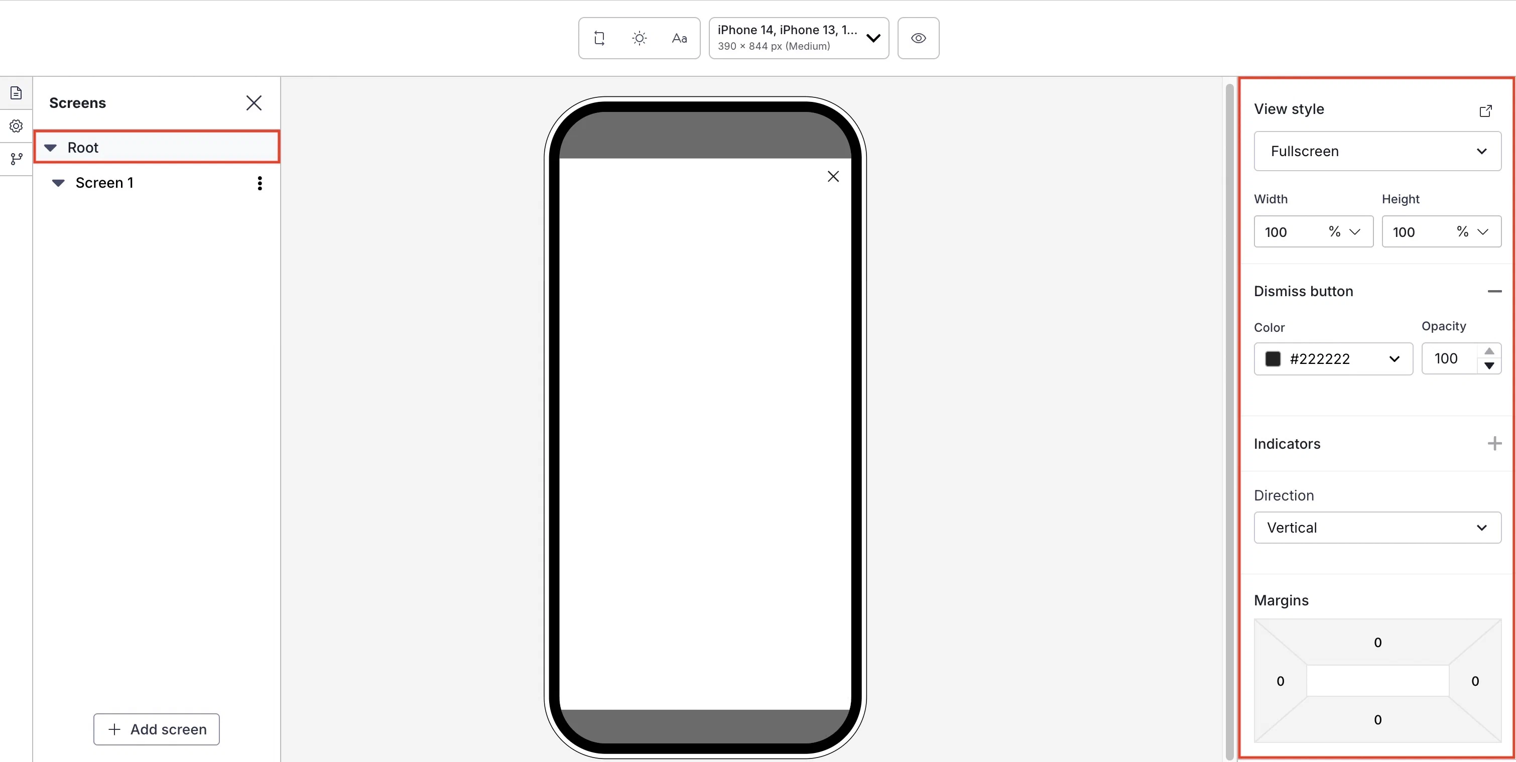
*Setting the root appearance for a Scene*
First, select a [view style defined in your project settings](https://www.airship.com/docs/guides/messaging/in-app-experiences/configuration/defaults/#scene-defaults).
To add or edit [conditional design overrides](https://www.airship.com/docs/guides/features/messaging/scenes/conditional-design-overrides/), select the external link icon (
) next to **View style** and follow step 5 in [Set fullscreen and modal view styles](https://www.airship.com/docs/guides/messaging/in-app-experiences/configuration/defaults/#set-fullscreen-and-modal-view-styles) in *In-App Experience Defaults*. The settings will apply to the current message only.
Next, configure design properties:
| Setting | Description | Steps |
| --- | --- | --- |
| **Width and Height** | The width and height of the Scene in pixels or as a percentage of the screen size. | Enter a numeric value and select a value type of percentage or pixels. |
| **Border color and opacity** | The color and transparency level of the Scene border. Only apparent when Height and Width are set to less than 100%. | Select a [Color Set](https://www.airship.com/docs/reference/glossary/#color_set) or enter a hexadecimal color value, and then set the opacity percentage. |
| **Border size** | The size of the Scene border in pixels. Only apparent when Height and Width are set to less than 100%. | Enter a numeric value. |
| **Border radius** (Embedded Content view styles) | Governs rounding the Scene's corners. Only apparent when height and width are set to less than 100%. [iOS SDK 19.6+](/docs/docs/developer/sdk-integration/apple/ios-changelog/#19.6.0) [Android SDK 19.9+](/docs/docs/developer/sdk-integration/android/changelog/#19.9.0) | Enter an integer from 0 to 100. |
| **Border radius** (Modal and fullscreen view styles) | Governs rounding the Scene's corners. Only apparent when Height and Width are set to less than 100%. For Top-positioned views, this applies to the bottom corners only. For Bottom-positioned views, this applies to the top corners only. | Enter an integer from 0 to 100. |
| **Shade color and opacity** | Required for non-fullscreen Scenes. The color and transparency level of the device screen surrounding a non-fullscreen Scene. Overrides the default color. | Select a [Color Set](https://www.airship.com/docs/reference/glossary/#color_set) or enter a hexadecimal color value, and then set the opacity percentage. |
| **Dismiss button** | Optional. Determines the presence of the "X" button used to close the Scene. When enabled, you can override the default color. Opacity determines the color transparency level. | Select the add icon () to enable. Select a [Color Set](https://www.airship.com/docs/reference/glossary/#color_set) or enter a hexadecimal color value for the button color, and then set the opacity percentage. Select the remove icon (
) to disable. |
| **Indicators** | Optional, for Scenes with multiple screens only, enabled by default. Determines the presence of the dots indicating the number of screens. When enabled, you can override the default colors of the active and inactive screens. Opacity determines the color transparency level.
Indicators cannot be hidden when [Story mode](https://www.airship.com/docs/guides/messaging/editors/native/behaviors/#story-mode) is enabled, ensuring the appearance of the progress bar that indicates the number of screens and their remaining duration. The progress bar is displayed using the Inactive color only. The option is disabled when using custom HTML. | Select the add icon () to enable. Select a [Color Set](https://www.airship.com/docs/reference/glossary/#color_set) or enter a hexadecimal color value for Active and Inactive, and then set the opacity percentage. Select the remove icon (
) to disable. |
| **Navigation control** | Optional. Displays left and right arrows for navigating between screens. This also supports navigation using keyboards and assistive technology. [iOS SDK 20.1+](/docs/docs/developer/sdk-integration/apple/ios-changelog/#20.1.0) [Android SDK 20.1.1+](/docs/docs/developer/sdk-integration/android/changelog/#20.1.1) | Select the add icon () to enable. Select a [Color Set](https://www.airship.com/docs/reference/glossary/#color_set) or enter a hexadecimal color value for the Background and Icon colors, and then set the opacity percentage. Select Size and Alignment. Select the remove icon (
) to disable. |
| **Play control** | Optional. Displays a button to play or pause automatic screen transitions. If a screen contains background video, this control also pauses or resumes background video playback. It also adds support for control using keyboards and assistive technology. Available only when [Story mode](https://www.airship.com/docs/guides/messaging/editors/native/behaviors/#story-mode) is enabled. [iOS SDK 20.1+](/docs/docs/developer/sdk-integration/apple/ios-changelog/#20.1.0) [Android SDK 20.1.1+](/docs/docs/developer/sdk-integration/android/changelog/#20.1.1) | Select the add icon () to enable. Select a [Color Set](https://www.airship.com/docs/reference/glossary/#color_set) or enter a hexadecimal color value for the Background and Icon colors, and then set the opacity percentage. Select Size and Alignment. Select the remove icon (
) to disable. |
| **Direction** | Determines whether content elements within a screen are arranged vertically or stacked. Vertical arrangement enables scrolling. Stacking arranges elements on top of each other, front to back. The first added element is at the bottom of a stack (furthest back), and the last is on top (front). | Select a direction. To rearrange the order of stacked elements, select and hold the drag handle icon () for an element, then drag and drop to a new position. |
| **Margins** (Embedded Content view styles) | Determines the spacing between the Scene and its parent bounds. Only apparent when Height and Width are set to less than 100%. See information about parent bounds in [Set Embedded Content view styles](https://www.airship.com/docs/guides/messaging/in-app-experiences/configuration/defaults/#set-embedded-content-view-styles) in *In-App Experience Defaults*. | Enter a numeric value for each margin. |
| **Margins** (Modal and fullscreen view styles)1 | Determines the spacing between the Scene and the screen's edges. Only apparent when Height and Width are set to less than 100%.
Margins are applied in combination with the Position set for the view style. For example, for a modal Web Scene set to the bottom right position, set a margin to create a gap between the Scene and the window edges. To set a Position, see the [View styles field reference](https://www.airship.com/docs/guides/messaging/in-app-experiences/configuration/defaults/#view-styles) in *Setting Scene defaults*. | Enter a numeric value for each margin. |
1. Setting both margins and a border in the same Scene requires minimum Android SDK 19.
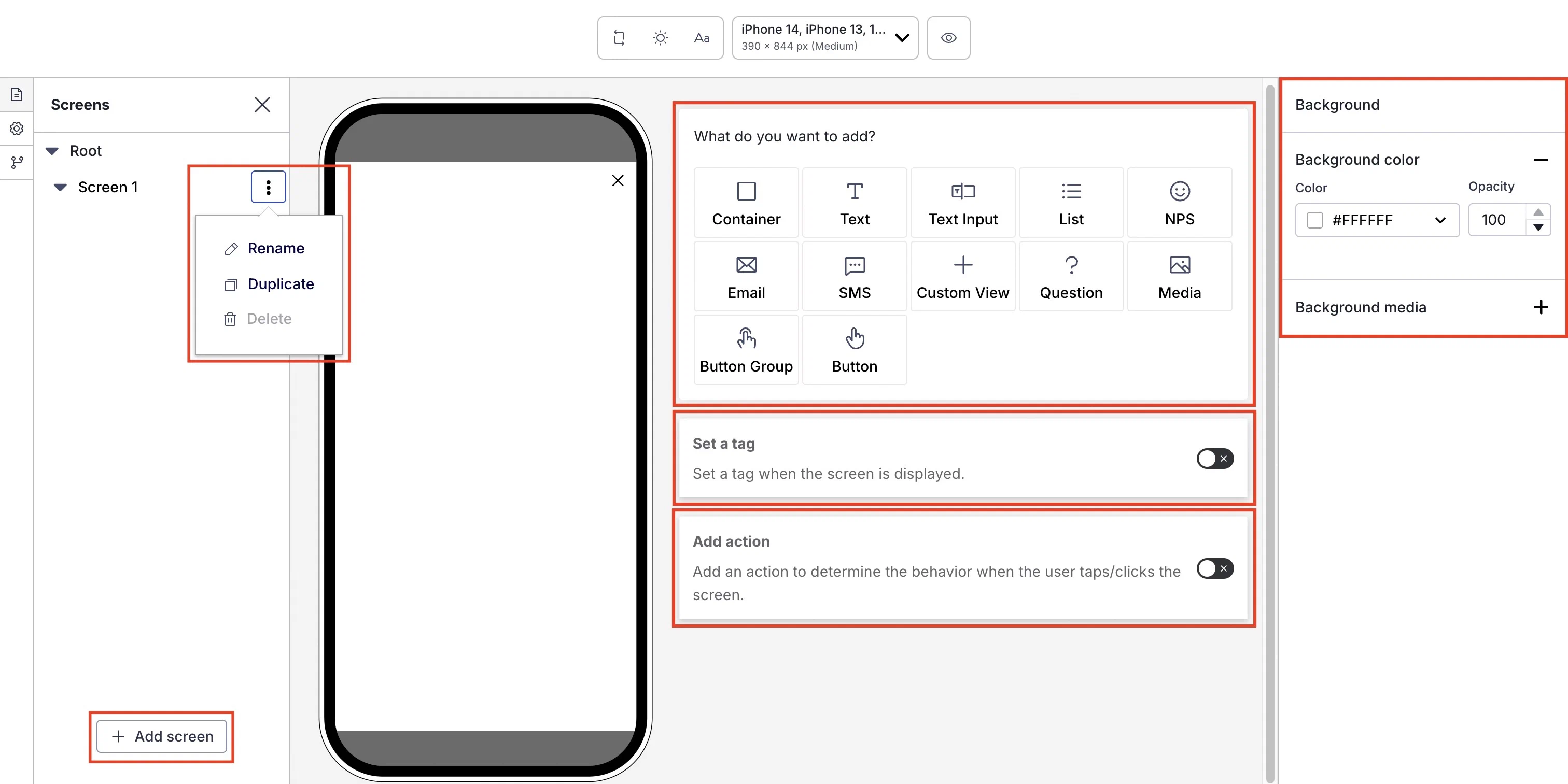
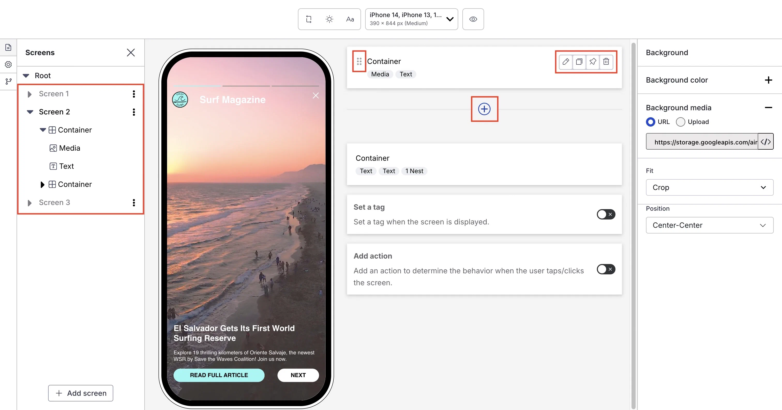
# Configuring screens
> Configure individual screens in the Native Experience editor, including background media, tags, actions, content elements, and AI-generated content.
Configure screens in the Content step when [creating a Scene](https://www.airship.com/docs/guides/messaging/in-app-experiences/scenes/create/) by selecting the file icon () in the left sidebar and then selecting one from the list. To add more, select ** Add screen** in the left sidebar. Scenes can have up to 20 screens.
For each, you can configure the following:
* [Set background color or media](#set-background-color-and-media) that appears behind the content elements.
* [Add content elements](#add-content-elements).
* [Set a tag](#set-a-tag) on the user when it displays.
* [Add an action](#add-an-action) that occurs when the user interacts with it.
*Configuring a new screen in a Scene*
## Managing screens
Manage screens in the left sidebar:
| Option | Steps |
| --- | --- |
| **Rename** | Select and hold the three dots icon (
) for a screen, select **Rename**, enter a new name. |
| **Reorder** | Select and hold the three dots icon (
) for a screen, then drag and drop to a new position. |
| **Duplicate or delete** | Select the three dots icon (
) for a screen, then select **Duplicate** or **Delete**. You cannot delete the only screen in a Scene. |
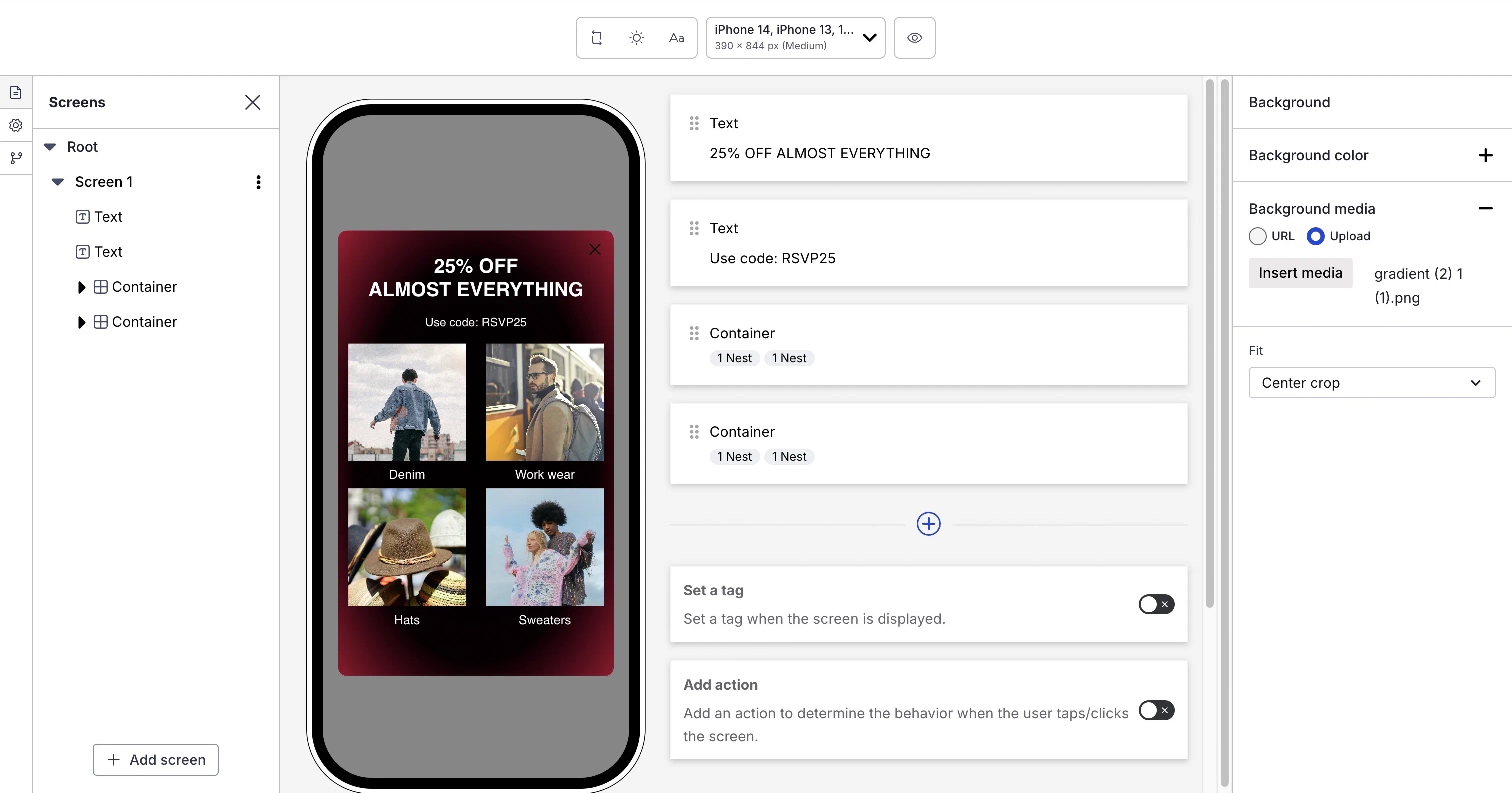
## Set background color and media
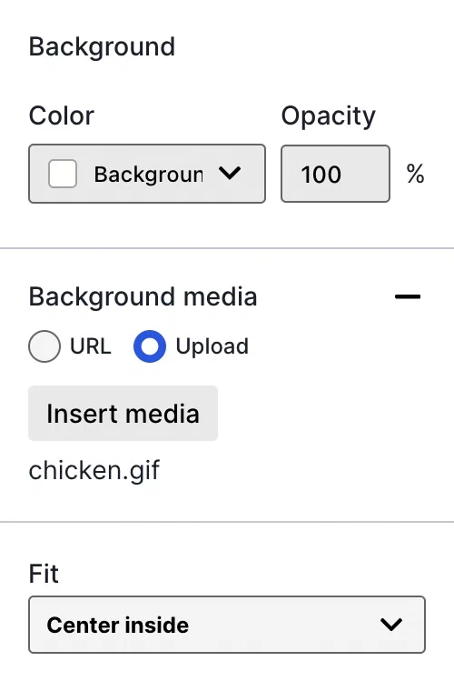
*Screen background options*
When configuring a screen, the right side sidebar displays options to set background color and media.
### Background color
The background color set here overrides the [default project setting](https://www.airship.com/docs/guides/messaging/in-app-experiences/configuration/defaults/#scene-defaults).
To set a background color:
1. Select the add icon () for **Background color**.
1. Select a [Color Set](https://www.airship.com/docs/reference/glossary/#color_set) or enter a hexadecimal color value, and then set the opacity percentage.
### Background media
Background media supports images and video. Background video displays in portrait mode, starts automatically, and plays in a loop. Orientation and behavior are different for video used in the [Media element](https://www.airship.com/docs/guides/messaging/editors/native/elements/#media).
To set background media:
1. Select the add icon () for **Background media**, then enter a URL of an image or video to use as the background. URLs must be HTTPS and accessible by your mobile audience.
If your Airship plan includes CDN support, you can also upload media or select from previously uploaded media. See Insert media in message content in Media library.
1. Select a Fit: Crop, Center crop, or Center inside. If you select Crop, also set a Position. For details about these settings, see [Media properties](https://www.airship.com/docs/guides/messaging/editors/native/design-properties/#media-properties) in *Design properties*.
### Video controls
[iOS SDK 20.6.2+](/docs/docs/developer/sdk-integration/apple/ios-changelog/#20.6.2) [Android SDK 20.5+](/docs/docs/developer/sdk-integration/android/changelog/#20.5.0)
If using background video, you can add play/pause and mute/unmute buttons to the screen, set their placement, and style their appearance. The Play control is not available in [Story](https://www.airship.com/docs/reference/glossary/#story) mode. Instead, use the [Play control setting for the root appearance](https://www.airship.com/docs/guides/messaging/editors/native/root/).
To add video controls:
1. Select the add icon () for **Video control**. Both **Play control** and **Audio control** are added by default. You can select the remove icon () to hide either.
1. Set the controls' alignment within the screen, as well as the background color and opacity. For each enabled control, set the size, as well as the icon color and opacity. For details about these settings, see [Media properties](https://www.airship.com/docs/guides/messaging/editors/native/design-properties/#media-properties) in *Design properties*.
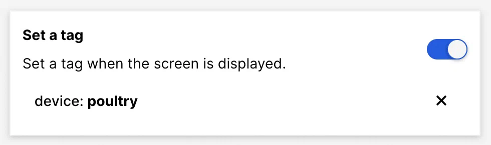
## Set a tag
*Setting a tag on screen display*
To set a tag when the screen displays, enable **Set a tag**, enter the tag you want to set, then select from the list of returned tags or select **Create new tag**.
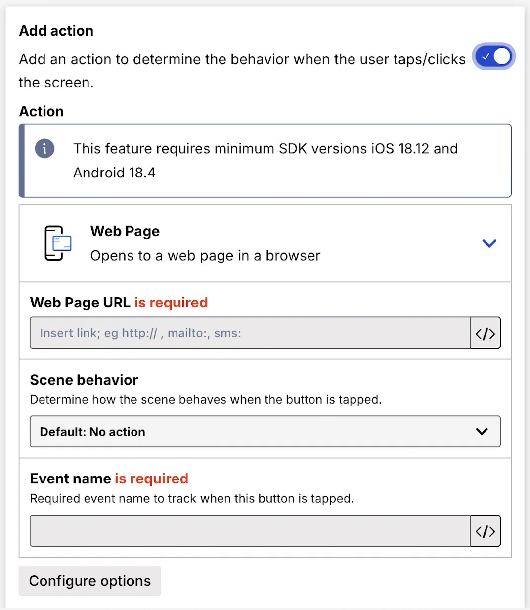
## Add an action
[iOS SDK 18.12+](/docs/docs/developer/sdk-integration/apple/ios-changelog/#18.12.0) [Android SDK 18.4+](/docs/docs/developer/sdk-integration/android/changelog/#18.4.0)
*Configuring an action for a screen*
You can set a behavior that occurs when a user taps/clicks the screen. You can also:
* Set a Scene behavior
* Set or remove a tag
* Opt a user in to or out of a [Subscription List](https://www.airship.com/docs/reference/glossary/#subscription_list)
* Emit a [Custom Event](https://www.airship.com/docs/reference/glossary/#custom_event)
Tap/click events are reported using the [In-app button tap event](https://www.airship.com/docs/developer/rest-api/connect/schemas/events/#in-app-button-tap) in the format button-tap-<event name>. For example, if you enter Cat socks55 for any action, the event name in reporting will be button-tap-Cat socks55. Event names also support [Handlebars](https://www.airship.com/docs/reference/glossary/#handlebars).
Enable **Add an action**, then follow the steps in [Actions for in-app experiences](https://www.airship.com/docs/guides/messaging/in-app-experiences/configuration/button-actions/). Also refer to the table of [supported actions for screens](https://www.airship.com/docs/guides/messaging/in-app-experiences/configuration/button-actions/#actions). An event name for the action is required.
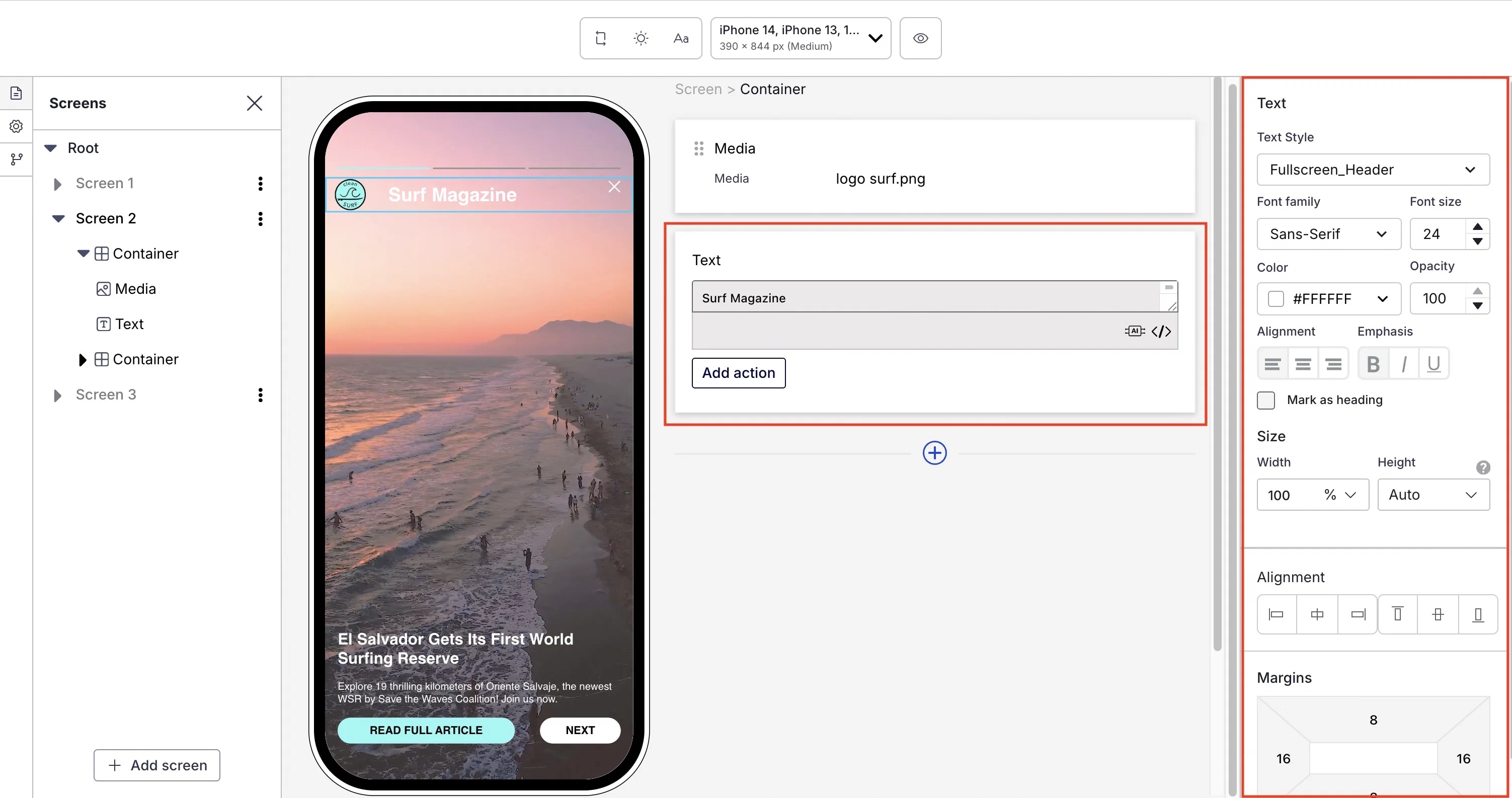
## Add content elements
To add content elements, select the add icon (
) and make a selection. See [Configure content elements](https://www.airship.com/docs/guides/messaging/editors/native/elements/) for detailed steps.
*Add and manage content elements*
After adding content elements, you can manage them in the center panel and left sidebar:
| Option | Steps |
| --- | --- |
| **Edit, duplicate, or remove** | Hover over an element and select the edit (), copy (), or delete icon (). To go directly to editing an element, double-click its name in the left sidebar. |
| **Fix container at bottom on scroll** | Hover over a Container element and select the pin icon () to keep the Container visible at the bottom of the screen when the user scrolls. When pinning multiple Containers, they appear in the order set when unpinned. To change their order, first unpin them, drag to a new order, then pin again. You cannot pin Containers nested inside other Containers. |
| **Reorder or move** | To reorder content elements within a screen, select and hold the drag handle icon () for an element, then drag and drop to a new position.
To reorder and move elements within a screen or container in the left sidebar, toggle the caret icon () to expand and collapse the lists of each screen's content elements and elements inside containers. Select and hold an element name and drag and drop to a new position. |
### Container navigation
To navigate between Containers and back to the root screen, you can select them in the left sidebar or use the breadcrumbs above a screen's content elements in the center panel. For example, when editing a container nested in another container, the breadcrumbs appear as `Screen > Container > Container`:
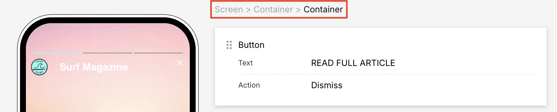
*Navigating Containers using breadcrumbs*
## Providing disclosures and other required information
It is important to state or link to necessary disclosures and other legal information within your communications to ensure regional regulation compliance and transparency with your users. For [SMS](https://www.airship.com/docs/guides/messaging/editors/native/elements/#sms), this includes disclosure of added SMS fees. For [Email](https://www.airship.com/docs/guides/messaging/editors/native/elements/#email), this may include disclosure requirements for email collection for marketing purposes.
While the exact placement is flexible, make sure the disclosure text and links are easily discoverable on the screen. Common and effective locations include next to an input field or prominently in the screen footer.
Use the [Text element](https://www.airship.com/docs/guides/messaging/editors/native/elements/#text) to add information that should appear on the current screen.
* To add a link for a selected portion of the text, use [Markdown styling](https://www.airship.com/docs/guides/messaging/editors/native/about/#markdown-styling).
* To make the entire text block function as a link, select **Add action** when configuring the Text element, choose **Web Page** or **Deep Link**, and enter the URL for the additional information. See the following in *Actions*:
* [Web Page](https://www.airship.com/docs/guides/messaging/in-app-experiences/configuration/button-actions/#web-page)
* [Deep Link](https://www.airship.com/docs/guides/messaging/in-app-experiences/configuration/button-actions/#deep-link)
> **Important:** When collecting phone numbers or email addresses using Scenes functionality, customers are responsible for ensuring compliance with all applicable regulations. This includes providing appropriate disclosures and obtaining necessary consent as required by law. Customers should include links to their SMS program terms and/or privacy policy as applicable to their specific use case and jurisdiction.
# Configure content elements
> Configure content elements for Scenes, including buttons, containers, media, text, questions, NPS, and input fields.
Configure content elements after [adding them to a screen](https://www.airship.com/docs/guides/messaging/editors/native/screens/#add-content-elements). For each element, configure its settings in the center panel and its [design properties](https://www.airship.com/docs/guides/messaging/editors/native/design-properties/) in the right sidebar.
*Configuring the Text content element and its design properties*
## Button or Button Group
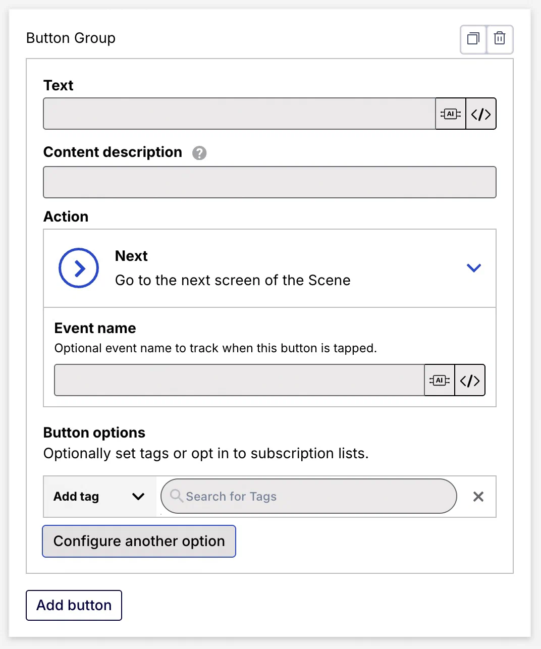
*Configuring the Button Group content element in a Scene*
Add a single button or up to five buttons in a group. When using multiple buttons in a screen, add single buttons if you want to place content between them, and use a button group to keep buttons together.
After configuring the first button in a group, select **Add button** for more. One Button Group is allowed per screen.
Set for each button:
| Field or setting | Description | Steps |
| --- | --- | --- |
| **Text** | Required. The button label. | Enter text. |
| **Content description** | Optional. Text to be announced by assistive technology such as screen readers. It is announced after the button label text. | Enter text. |
| **Loading state text** | Optional, appears only for buttons using the [Validate Form](https://www.airship.com/docs/guides/messaging/in-app-experiences/configuration/button-actions/#validate-form) or [Submit Responses](https://www.airship.com/docs/guides/messaging/in-app-experiences/configuration/button-actions/#submit-responses) action. The text momentarily replaces the button label text while the action occurs. Example loading state text: "Processing", "Processing...", "Submitting now!". | Enter text. |
| **Action** | Required. The behavior that occurs when a user taps/clicks the button. You can also add or remove a [Tag](https://www.airship.com/docs/reference/glossary/#tag), emit a [Custom Event](https://www.airship.com/docs/reference/glossary/#custom_event), and/or opt a user into or out of a [Subscription List](https://www.airship.com/docs/reference/glossary/#subscription_list) when they tap the button. | Select and configure an action and options. Follow the steps in [Actions for in-app experiences](https://www.airship.com/docs/guides/messaging/in-app-experiences/configuration/button-actions/). |
| **Action: Scene behavior** | Optional. Determines how the Scene behaves when a user taps the button: **No action**, **Next screen**, **Previous screen**, **Dismiss** (closes the Scene), or **Dismiss and cancel Repeat** (closes the Scene and overrides the [Repeat setting](https://www.airship.com/docs/guides/messaging/in-app-experiences/configuration/optional-features/#repeat-this-message)).
Scene behavior is not available for the button actions Dismiss Message, Next, and Previous. The Preference Center and Deep Link button actions have Scene behavior options **Dismiss** and **Dismiss and cancel Repeat** only, with default behavior **Dismiss**. For all other button actions, all Scene behaviors are available, with default behavior **No action**. | Select a behavior. |
| **Action: Event name** | Optional. A specific event name for tracking link clicks/taps. By default, the total taps/clicks for all buttons and text configured with an action in a Scene are reported using the [In-app button tap event](https://www.airship.com/docs/developer/rest-api/connect/schemas/events/#in-app-button-tap) in the format `button-tap---