For [In-App Automation](https://www.airship.com/docs/reference/glossary/#iaa) defaults, set values for background, text, and buttons per message style: Banner, Modal, Fullscreen, and HTML.
[Scene](https://www.airship.com/docs/reference/glossary/#scene) defaults are a mix of appearance and property defaults. Set default colors for the background, dismiss button, and indicators. Name and define view, text, input, and button styles that you can select when configuring appearance defaults and when configuring the content of individual Scenes. | [In-App Automation defaults](#setting-in-app-automation-defaults) and [Scene defaults](#scene-defaults) | {class="table-col-1-20 table-col-3-30"} ### Applying changes to existing messages In-app experiences are cached on users' devices then displayed when certain conditions are met. Edits made to individual messages are applied upon the next app open. Users who trigger the message after you save your edits will see the latest version of the message. When you make changes to your project's in-app experience defaults, they are applied to all new in-app experiences. You can also apply the changes to defaults settings to existing messages by editing the message: 1. Open the message for editing, from either: * [Messages Overview](https://www.airship.com/docs/reference/glossary/#messages_overview): Go to **Messages**, then **Messages Overview**, and then hover over the message you want to edit and select the edit icon ( ). * [Journey Map](https://www.airship.com/docs/reference/glossary/#journey_map): Go to **Journeys** and search for a message, then select its card at the center of the map, then select the edit icon (✏). 1. Edit any part of the message. 1. Save your changes: * If you are editing a draft and not ready to send, select **Exit**. * If you are editing an active message or ready to send, go to the **Review** step and select **Update** if the message is already active or select **Finish** for a new message. > **Note:**
Edits are not applied to active messages that have already been triggered by a user. For instance, for a message configured to display when viewing a specific app screen, if you edit the message after the trigger event occurred for a user but before they have viewed the specific app screen, they will see the version of the message that does not contain your edits.
## Colors A *Color Set* is a named pair of hexadecimal color values supporting device Light and Dark modes. Color sets can be selected for any color field in a Scene and when configuring the default appearance of Scenes and In-App Automations. Dark mode is supported for Scenes only. To create color sets, see [Setting brand guidelines](https://www.airship.com/docs/guides/messaging/features/brand-guidelines/). ## Fonts When configuring the content of your in-app experiences, or when setting their defaults, you must set a *Font family* and a *Font size* for text, including button labels. For *Font family*, all projects contain a serif and a sans-serif font. You can also add custom fonts so your in-app experiences use the same fonts as the rest of your app. To set custom fonts, see [Setting brand guidelines](https://www.airship.com/docs/guides/messaging/features/brand-guidelines/). --- For *Font size* in Scenes, set a value when configuring text styles. You can then select a text style that applies to the default appearance of button labels and input fields. See [Set text, button, and input styles](#set-text-button-and-input-styles) in *Scene defaults* below. You also select text styles when [configuring Scene content](https://www.airship.com/docs/guides/messaging/editors/native/about/). --- For *Font size* in In-App Automations, first define default font sizes: 1. Next to your project name, select the dropdown menu (▼), then **Settings**. 1. Under **App settings**, select **In-App Automation**. 1. For **Font Sizes**, enter a value in points for small, medium, and large sizes of **Header**, **Body**, **Footer**, and **Button** text. 1. Select **Save**. Next, select Small, Medium, or Large for the header, body, footer, and button **Font size** fields for each In-App Automation style. See [In-App Automation defaults](#setting-in-app-automation-defaults) below. You can override these settings when configuring text design in the Classic editor. See the [Design step](https://www.airship.com/docs/guides/messaging/in-app-experiences/in-app-automation/create/#design) in *Create an In-App Automation*. ## Scene defaults [AXP](https://www.airship.com/docs/reference/feature-packages/) Set default values for [Scene](https://www.airship.com/docs/reference/glossary/#scene) appearance and behaviors, including background colors, breakpoints, and styles for views, text, input fields, and buttons. A Scene's view determines whether it appears as fullscreen, a modal window, or [Embedded Content](https://www.airship.com/docs/reference/glossary/#embedded_content), along with other settings related to its type. Styles are collections of settings that determine the appearance of views, text, input fields, and buttons. You can select a style to apply all its settings at once. All projects contain preset styles you can rename, customize, and remove. You can also create custom styles. Requirements and behaviors for styles: * At least one style for each type is required, excluding Embedded Content view styles, which are optional. * If you remove a preset view style that is in use in your Scenes, the first view style in your list is applied to those Scenes. * Previously set hexadecimal color values appear until you create your first [color set](#colors) selection and save your changes. When configuring Background settings and view styles, the device preview updates as you type and make selections. Use the tools above the preview as you adjust settings: | Tool | Description | Steps | | --- | --- | --- | | **View** | For Background and Embedded Content view styles only. Determines which view style to preview. | Select a view style. | | **App/Web format** | This tool displays the Scene as it will appear in an app or website. The buttons only appear when both App and Web are enabled. | Select the grid icon (squares-four) for App or the globe icon (globe) for Web. | | **Orientation** | This tool shows how the Scene will appear when the device or monitor is rotated. | Toggle the device orientation icon (device-rotate). | | **Light/Dark mode** | Shows the appearance of elements with an assigned [color set](#colors). Light Mode values appear in Dark Mode preview if no Dark Mode value was entered for a color set. | Toggle the sun icon (sun) and moon icon (moon). | | **Device/Screen size** | This tool provides a more accurate representation of how the Scene will appear on a specific screen size. | Select a device or screen size. | ### Set background Background settings apply to all new Scenes. 1. Next to your project name, select the dropdown menu (▼), then **Settings**. 1. Under **App settings**, select **Scenes**. 1. For **Background**, configure: | Field | Description | Steps | | --- | --- | --- | | **Background color** | The color of screen backgrounds. | Select a [color set](#colors). | | **Shade color** | The color of the device screen surrounding a modal Scene. Applies to all modal view styles. | Select a [color set](#colors). | | **Dismiss button color** | The color of the "X" button used to close the Scene. | Select a [color set](#colors). | | **Indicator colors** | The colors of the dots that indicate the number of screens and their active/inactive state in a multi-screen Scene. When Story mode is enabled, they are in the form of a progress bar that indicates the number of screens and their remaining duration. The Story mode progress bar is displayed using the inactive color only. | Select a [color set](#colors) for the active (current screen) and inactive states. | | **Breakpoints** | The width in pixels for Medium and Large device screen breakpoints for Web Scenes [as configured by your developer in the Web SDK](https://www.airship.com/docs/developer/sdk-integration/web/in-app-experiences/#screen-sizes-and-breakpoints). **These values are for preview purposes in the Airship dashboard only. They are not passed to a device.** | Enter a numeric value. | 1. Select **Save**. ### Set text, button, and input stylesThe styles for text, button, and input fields can be selected when configuring other default settings and when creating Scene content. Input styles control the appearance of the user input fields for the Email, SMS, Text Input, and Open Question content elements.
To set text, button, or input styles, see [Setting brand guidelines](https://www.airship.com/docs/guides/messaging/features/brand-guidelines/). ### Set fullscreen and modal view styles Each project supports up to 25 fullscreen and modal view styles and contains a preset of each, which you can edit or remove. To set the view styles: 1. Next to your project name, select the dropdown menu (▼), then **Settings**. 1. Under **App settings**, select **Scenes**. 1. Select **View Styles**. 1. Select the edit icon (✏) for an existing style or select **+ Add view style**, and then configure: | Field | Description | Steps | | --- | --- | --- | | **Name** | A descriptive name for the style. The name appears in the list of all view styles in the Settings section of a Scene. | Enter text. | | **Orientation lock** | Forces the Scene to display in the set orientation when the device is rotated to another orientation. Options: Portrait, Landscape, None. | Select an orientation or **None**. | | **Position** | The vertical and horizontal position of the Scene relative to the device screen. Only apparent when Height and Width are set to less than 100%. You can set top, middle, or bottom for the vertical axis and left, middle, or right for the horizontal axis. The preset Modal default value is Middle. | Select a position. | | **Width** | The width of the Scene in pixels or as a percentage of the device screen window size. The preset Modal default value is 80%. | Enter a numeric value and select a value type of percentage or pixels. | | **Height** | The height of the Scene in pixels or as a percentage of the device screen window size. The preset Modal default value is 75%. | Enter a numeric value and select a value type of percentage or pixels. | | **Border color** | The color of the Scene border. Only apparent when Height and Width are set to less than 100%. | Select a [color set](#colors). | | **Border size** | The size of the Scene border in pixels. Only apparent when Height and Width are set to less than 100%. | Enter a numeric value. | | **Border radius** | Governs rounding the Scene's corners. Only apparent when Height and Width are set to less than 100%. For Top-positioned views, this applies to the bottom corners only. For Bottom-positioned views, this applies to the top corners only. The preset Modal default value is 0. | Enter an integer from 0 to 100. | | **Disable shade** | Removes the shade in a modal Scene so the website behind can be accessed. Supported for Web only. | Check the box disable the Shade. | 1. (Optional) Set [Conditional design overrides](https://www.airship.com/docs/guides/features/messaging/scenes/conditional-design-overrides/): 1. Select **Add override**. 1. Set the conditions that must be met for the overrides to apply: | Condition | Options and examples | | --- | --- | | **Orientation** | Portrait, Landscape, or Any | | **Size** | Small (most smartphones in landscape orientation), Medium (all smartphones), or Large (phablets and tablets) screen size or All | 1. (Optional) Select **Lock orientation** to display the Scene using your selected orientation even when the device is rotated. 1. Configure the values for the following that should apply when the override conditions are met: Position, Height, Width, Border color, Border size, Border radius, and Disable shade. 1. Select **Save** for the view style and overrides. 1. Select **Save** for your default settings. ### Set Embedded Content view styles [iOS SDK 18.7+](/docs/docs/developer/sdk-integration/apple/ios-changelog/#18.7.0) [Android SDK 18.1.4+](/docs/docs/developer/sdk-integration/android/changelog/#18.1.4) Each project supports up to 100 [Embedded Content](https://www.airship.com/docs/reference/glossary/#embedded_content) view styles. Understanding how Embedded Content sizing works can help ensure that it always fits within the intended area of your app or website and behaves predictably across devices and layouts. 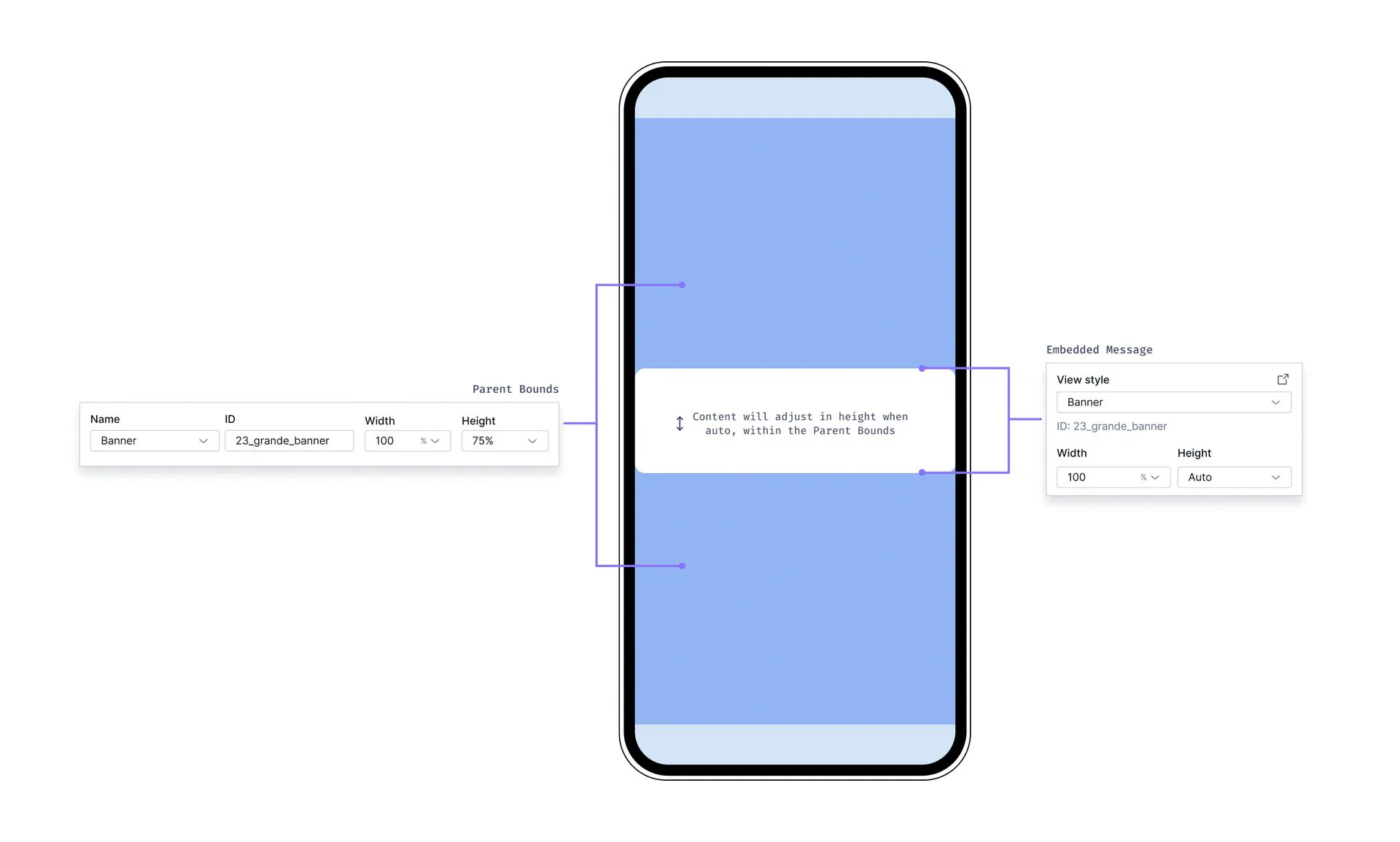 *Settings for Embedded Content view styles* **Parent bounds** When setting your Embedded Content view styles, you define the Parent Width and Parent Height. These settings are intended to match what was set by a developer in your app's code to represent your content more accurately in the Scene editor preview. While these dimensions are for preview purposes only, it is helpful to understand that they define the maximum space that your embedded content can occupy on the device screen. When editing content in a Scene, you can set margins that determine the spacing between the Scene and its parent bounds. See [Root appearance](https://www.airship.com/docs/guides/messaging/editors/native/root/). **Sizing behavior** - The maximum area available for your Embedded Content is determined by the Parent Bounds. - By default, the height of your Embedded Content is set to **Auto** and will adjust to fit the content within it. - You can override the default sizing by setting explicit Width and Height values in the settings panel when [setting the root appearance](https://www.airship.com/docs/guides/messaging/editors/native/root/) of your scene. - Width cannot be set to **Auto**, it must be a percentage or pixel value. - Height cannot be set to **Auto** when the Embedded Content is part of a multi-screen embedded scene. However, you can manually set the height to a lower percentage. - If your embedded view is inside a `ScrollView` (as set in your app code), the content area will be scrollable. To set the view styles: 1. Next to your project name, select the dropdown menu (▼), then **Settings**. 1. Under **App settings**, select **Scenes**. 1. Locate an existing view style to edit or select **+ Add view style**, and then configure: | Field | Description | Steps | | --- | --- | --- | | **Name** | A descriptive name for the style. The name appears in the list of all view styles in the Settings section of a Scene. | Enter text. | | **ID** | An identifier used to reference the Scene's content in your app's code. | Enter a value. | | **Description** | Text that describes the purpose of the style. | Enter text. | | **Parent width** | The Scene's width in pixels or as a percentage of the parent container's viewable area as determined by a developer in your app's code. **This value is for preview purposes in the Airship dashboard only. It is not passed to a device.** | Enter a numeric value and select a value type of percentage or pixels. | | **Parent height** | The Scene's height in pixels or as a percentage of the parent container's viewable area as determined by a developer in your app's code. **This value is for preview purposes in the Airship dashboard only. It is not passed to a device.** | Enter a numeric value and select a value type of percentage or pixels. | | **Border color** | The color of the Scene border. Only apparent when Parent height and width are set to less than 100%. | Select a [color set](#colors). | | **Border size** | The size of the Scene border in pixels. Only apparent when Parent height and width are set to less than 100%. | Enter a numeric value. | | **Border radius** | Governs rounding the Scene's corners. Only apparent when Parent height and width are set to less than 100%. [iOS SDK 19.6+](/docs/docs/developer/sdk-integration/apple/ios-changelog/#19.6.0) [Android SDK 19.9+](/docs/docs/developer/sdk-integration/android/changelog/#19.9.0) | Enter an integer from 0 to 100. | 1. Select **Save**. ## Setting In-App Automation defaults Set defaults for the background, text, and buttons in [In-App Automations](https://www.airship.com/docs/reference/glossary/#iaa). The settings are pre-configured when you create a new In-App Automation. See also [Colors](#colors) and [Fonts](#fonts) above. > **Note:** For In-App Automation, these defaults apply to the Classic editor only. You cannot set defaults for the Interactive editor. First, navigate to the settings: 1. Next to your project name, select the dropdown menu (▼), then **Settings**. 1. Under **App settings**, select **In-App Automation**. Next, manage the settings. Navigation differs depending on whether you have App or Web Scenes enabled for your project: 1. (If you do not have Scenes) Complete the remaining steps in the **Design** section. 1. (If you do have Scenes) Select **Styles**. 1. Configure each message style: Banner, Modal, Fullscreen, (Custom) HTML. See the [Field reference for In-App Automations](#field-reference-for-in-app-automations) for the fields and options per settings section for each message style. The device preview (not available for HTML) updates as you type and make selections. Previously set hexadecimal color values will appear until you create your first [color set](#colors) selection and save your changes. 1. Select **Save**. ### Setting transparent background While you can set the background to transparent in general, this information applies to modal In-App Automations only. Modal In-App Automations display within an HTML container that has a white background. You can eliminate the white background by setting the background color of the HTML style to transparent. 1. Next to your project name, select the dropdown menu (▼), then **Settings**. 1. Under **App settings**, select **In-App Automation**. 1. Select **Styles**, then **HTML**. 1. Enter `#00000000` for the background color. 1. Select **Save**. ## Field reference for In-App Automations Refer to these descriptions and configuration details when [setting defaults for In-App Automation styles](#setting-in-app-automation-defaults). Fields and options per settings section for each In-App Automation message style: | Settings | Banner | Modal | Fullscreen | HTML | | --- | --- | --- | --- | --- | | **[Background](#background-iaa)** | Background color, Dismiss action color, Border radius, Position | Background color, Dismiss action color, Border radius, Display fullscreen on small screen devices | Background color, Dismiss action color | Same as Modal | | **[Text](#text-iaa)** | Header and Body: Font family, Font size, Alignment, Color, Emphasis | Same as Banner | Same as Banner, for Header, Body, and Footer | n/a | | **[Buttons](#buttons-iaa)** | Font family, Font size, Border radiusFor two buttons: Text color, Background color, Border color | Same as Banner | Same as Banner, for five buttons | n/a | ### Background {#background-iaa} Set for background fields: | Field | Description | Steps | | --- | --- | --- | | **Position** | The vertical screen position of a banner message. A message set to **Top** appears by animating down from the top of the device window. A message set to **Bottom** animates up from the bottom of the device window. | Select a position. | | **Border radius** | Governs rounding the corners of a banner, modal, or custom HTML message. For banner messages, this applies to bottom corners for top-positioned messages and top corners for bottom-positioned messages. | Enter an integer from 0 to 100. | | **Background color** | The color of the message background. | Select a [color set](#colors). See also [Setting transparent background](#setting-transparent-background). | | **Dismiss action color** | For banner messages, this is the color of the drawer pull element that indicates the direction the user can swipe to dismiss the message. For modal, full screen, and custom HTML messages, this is the color of the "X" button used to dismiss the message. | Select a [color set](#colors). | | **Display fullscreen on small screen devices** | Stretches modal and custom HTML message layouts to fullscreen on small devices, e.g. mobile phones, maintaining the same button layout. Use this setting if you want your message to take over the entire screen on a phone but display as a modal on a tablet. The default display of custom HTML messages is modal. | Check the box to enable. | ### Buttons {#buttons-iaa} Set for button fields: | Field | Description | Steps | | --- | --- | --- | | **Font family** | The font of the button text: serif, sans-serif, or a [custom font stack](#fonts). | Select a font or font stack. | | **Font size** | The size of the font in points, defined as **Small**, **Medium**, or **Large** [default values](#fonts). | Select a size. | | **Border radius** | Governs rounding the button corners. | Enter an integer from 0 to 100. | | **Text color** | The color of the button text. This should contrast with the background color. | Select a [color set](#colors). | | **Background color** | The color of the button background. | Select a [color set](#colors). | ### Text {#text-iaa} Set for text fields: | Field | Description | Steps | | --- | --- | --- | | **Font family** | The font of the text: serif, sans-serif, or a [custom font stack](#fonts). | Select a font or font stack. | | **Font size** | The size of the font in points, defined as **Small**, **Medium**, or **Large** [default values](#fonts). | Select a size. | | **Emphasis** | The format of the text: bold, italic, or underline. | Select an emphasis. | | **Alignment** | The horizontal position of the text: left, middle, or right. | Select an alignment. | | **Color** | The color of the text. | Select a [color set](#colors). | # In-App Experience Triggers > A trigger is an event that causes an In-App Automation or Scene to appear in a mobile app. Scenes also support mobile web browsers. You can configure triggers in an in-app experience [Composer](https://www.airship.com/docs/reference/glossary/#composer) or the [Journey Map](https://www.airship.com/docs/reference/glossary/#journey_map). In the map, you also have the option to complete the same configuration as in the composers' Audience step. ## Configuring triggers in a composer In the Behavior step of a composer, select and configure a [trigger](#triggers). Select **Add another** to add another trigger. Multiple triggers are handled as a boolean OR. Next, configure options: 1. Specify [cancellation events](#cancellation-events). 1. [Set a tag](#set-a-tag) when the message is displayed. 1. Set [display conditions](#display-conditions). If you set a cancellation event, you must configure at least one display condition. You can now select the next step in the composer. > **Important:** Other than setting a tag, you cannot add, edit, or remove triggers or any part of the composer Behavior step after the in-app experience is made active or while it is paused. ## Configuring triggers and audience in the Journey map  *Configure an In-App Automation or Scene trigger and audience* In the Journey map: 1. Select the trigger card, then select the edit icon (✏). If multiple triggers are configured, first select the trigger stack to expand it, and then select a trigger card, or you can select the add icon (+) below the configured triggers. All methods open the configuration drawer. 1. Under **Triggers**, select and configure a [trigger](#triggers). Select **Add another** to add another trigger. Multiple triggers are handled as a boolean OR. 1. (Optional) Under **Display Conditions**, set [display conditions](#display-conditions) and [cancellation events](#cancellation-events). 1. (Optional) Under **Audience Conditions**, determine who can see your message:
| Option | Description | Steps |
|---|---|---|
| All Users | Your entire app and/or web audience | n/a |
| Target Specific Users | Audience members in a group you define | See Targeting Specific Users. |
| Test Users | Members of a [Test Group](https://www.airship.com/docs/reference/glossary/#preview_test_groups) | Select a Test Group. |
| Feature Flag Audience | Members of a [Feature Flag](https://www.airship.com/docs/reference/glossary/#feature_flag) Configuration audience1 | Search for a flag by name, display name, or description, and then select a Configuration. |
1. Configurations using the Feature Flag access condition are excluded.
1. Select **Save**. > **Important:** You cannot edit the trigger configuration, cancellation events, or display conditions after the in-app experience is made active or while it is paused. You can edit the audience. > > * To view the trigger configuration, cancellation events, and display conditions or to [set a tag](#set-a-tag) when the message is displayed, edit the in-app experience and go to the Behavior step. > * To view or edit the audience configuration or set up a [Scene rollout](https://www.airship.com/docs/guides/features/messaging/scenes/rollouts/), edit the in-app experience and go to the Audience step. ## Triggers All triggers are supported for both In-App Automations and Scenes except for Web URL, which is for Web Scenes only. ### App Open (Mobile App), Session Start (Web) The *App Open (Mobile App), Session Start (Web) trigger* causes an In-App Automation or Scene to appear based on the number of times your audience opens your app or starts a web session. Enter the number of times your audience must open your app or start a web session before the message will appear. #### App Open behavior A mobile app open is generated any time the mobile app changes from the background to the foreground, so message display timing varies depending on whether a user has opened the app before or currently has the app open. For a message with an App Open value of 1: * **If a user has never opened the app before**, they will see the message the first time they open the app. * **If a user has opened the app before and does not currently have the app open**, they will see the message the next time they open the app. * **If a user currently has the app open**, the message will appear during the current session. > **Tip:** If you are configuring a "Welcome" message intended to display when users first open your app: > > * Set the App Open trigger value to 1. > * Add the **New users** channel condition. See [Targeting specific users](https://www.airship.com/docs/guides/audience/segmentation/target-specific-users/). > > If you want an onboarding message to appear the third time users open your app, set the App Open trigger value to 3. #### Session Start behavior A *web session* occurs when an end user directly visits a website with the Airship Web SDK present or by clicking or tapping a Web Push Notification that leads the visitor to the website. The page the user visits must have the Web SDK installed to track sessions. A new session is generated after 30 minutes of inactivity. So, message display timing varies depending on whether a user visited the website in the past 30 minutes. A new session will not be generated within 30 minutes of when a previous session started. For a message with a Session Start value of 1: * **If a user has never visited the website before**, they will see the message the first time they visit the website. * **If a user visits the website and has visited the website in the past 30 minutes**, they will see the message the next time they visit the website. * **If a user is currently viewing the website**, the message will appear during the next visit if it is 30 minutes after the current session started. ### App Update The *App Update trigger* causes an In-App Automation or Scene to appear when your audience opens your app or starts a web session for the first time after an app or website update update. Configuration steps: 1. Select **All app updates** or **Specific app updates**. 1. (For specific app updates) Set versions for each of your app's platforms. * Select **any version** or the operator you want to use to evaluate specific version numbers. * If you selected an operator, enter the version numbers you want to evaluate against. For Android apps, enter the `versionCode`. You can find your app's `versionCode` in your Google Play dashboard. For Web apps, [set an `appVersion` using the Web SDK](https://www.airship.com/docs/developer/sdk-integration/web/in-app-experiences/#app-version-updates). > **Note:** The **Is between** operator includes boundary values. For example, entering versions 4.3 - 5.1 includes 4.3 and 5.1. ### Custom Event The *Custom Event trigger* causes an In-App Automation or Scene to appear to your audience when Custom Events occur a specified number of times. [Custom Events](https://www.airship.com/docs/reference/glossary/#custom_event) capture key events in your app or website, such as screen views, media views, stories read, button clicks, items purchased or added to cart. > **Note:** [Server-side events](https://www.airship.com/docs/guides/audience/events/custom-events/#server-side-events) cannot be used to trigger an [In-App Automation](https://www.airship.com/docs/reference/glossary/#iaa) or [Scene](https://www.airship.com/docs/reference/glossary/#scene). > > Custom Events used for In-App Automation or Scene triggers must be client-side events. Web Scenes can only use Custom Events tracked using the Web SDK. App Scenes and In-App Automations can only use Custom Events tracked using the Mobile SDK. Configuration steps: 1. Search for an event. Results are limited to events that occurred in the last 30 days. If the event name you search for does not appear, select **Use [search term]** to use the event name as entered. 1. Enter the number of times the event must occur before the message will display. 1. (Optional) Select **Add Another** to add more Custom Events. Multiple events are handled as a boolean OR. #### Filtering Custom Events {#filtering-custom-events} When configuring the Custom Event trigger, you can filter Custom Events that are set on [Channel IDs](https://www.airship.com/docs/reference/glossary/#channel_dev), using numeric values associated with those Custom Events, or by key/value properties attached to the events. Filtering events this way can help you more precisely target your audience.For example, if you have a custom event named “Purchase”, with a purchase category fedoras and a value 125.0 representing the dollar amount of the purchase, you can add these criteria to the Purchase event so that your message is only seen by users spending at least $125 on fedoras.
To include a tokenized value for matching dynamic URLs, use the format `/products/:id`. You must enter a value and select an operator for each token in the path. Only one condition can include tokens. For multiple tokens, include them in the same condition. To match any number of path sections at the start or end of a path, use the asterisk (*) wildcard character. | **Static path value:** `/products/reviews/`
**Dynamic path value with token:** `/products/:id/reviews`
**Token value:** `1109`
The above path and token values will match a URL containing `/products/1109/reviews`.
**Wildcard:** `/products*`
The above path would match both `/products/1109/reviews` and `/products/reviews`. | | **Hash** | An anchor to a location on a web page | #my-anchor | | **Query parameter** | A key/value pair in the format `param=value` | utm_campaign=winter_clearance | {class="table-col-1-20 table-col-2-40"} 1. Select **Add condition** to enter more criteria. We recommend testing each variation of the URLs defined in your conditions to verify they will successfully trigger a Scene. Under **Test a URL...**, enter a sample URL, select **Test trigger**, and view the success or failure response. #### Example conditions configurations The following are example conditions for various Web URL scenarios: **Visits any product page**: * URL part: Path * Operator: contains * Value: `/products/` **Visits a campaign landing page**: * URL part: Full URL * Operator: starts with * Value: `https://example.com/spring_sale/` **Completes a purchase**: * URL part: Path * Operator: equals * Value: `/cart/:cart_id/checkout/complete` With: * Token name: cart_id * Operator: is anything #### Using URLs in personalization Web URL trigger components can be used to personalize messages with [Handlebars](https://www.airship.com/docs/reference/glossary/#handlebars). When a Web Scene is triggered with a URL, the following properties are available: | Component | Description | | --- | --- | | **`{{url.protocol}}`** | The protocol — For example, `http` or `https` | | **`{{url.domain}}`** | The domain — For example, `example.com` | | **`{{url.path}}`** | The full path — For example, `/products/123` | | **`{{url.path_groups}}`** | The named tokens defined in the trigger — For example, `/products/:id` would yield `{{url.path_groups.id}}`. | | **`{{url.search_params}}`** | The parsed query string of the page — For example, `?utm_source=airship` would yield `{{url.search_params.utm_source.0}}`. _Note: Search parameter values are arrays of strings. If your search parameter contains a single string value, access it using index 0._ | | **`{{url.hash}}`** | The anchor portion of the URL — For example, `#my-anchor-tag` | ## Trigger Options Configure additional behaviors for your In-App Automation or Scene. ### Cancellation Events Cancellation events prevent the message from appearing if a specified Custom Event occurs. You must also specify at least one [display condition](#display-conditions). Configuration steps: 1. Enable **Cancellation Events**. In the [Journey Map](https://www.airship.com/docs/reference/glossary/#journey_map), you must set a display condition before you can enable Cancellation Events. 1. Complete the same workflow used for the [Custom Event trigger](#custom-event) and optional [filtering](#filtering-custom-events). ### Set a Tag The ability to set a tag when the message displays is key to promoting new features. The suggested approach is to display messages regarding a feature if the tag does not exist, and to then set the tag to record either the fact that the user has acknowledged the message, or to record actual usage of the feature. * If you are using [localized content for in-app-automation](https://www.airship.com/docs/guides/messaging/in-app-experiences/in-app-automation/localization/), this setting is instead in the Actions step. For Scenes, this setting is instead available per screen in the Content step. * This setting is not available when configuring triggers in the Journey map. Configuration steps: 1. Enable **Set a tag**. 1. Search for tags that exist in the system or create a new tag. ## Display Conditions Display conditions determine whether or not your message displays after a trigger event occurs. The message does not display until your conditions are met. In the composers, if you set a [cancellation event](#cancellation-events), you must also set at least one display condition. In the [Journey Map](https://www.airship.com/docs/reference/glossary/#journey_map), you cannot enable **Cancellation Events** until you set a display condition. ### Time Has Elapsed Set how much time must elapse after receiving the triggering event before your message is eligible for display, up to 24 hours. Configuration steps: 1. Enable **Time has elapsed**. 1. Enter an amount of time in seconds, minutes, or hours. ### Viewing a Specific App Screen {#screenview-condition} Limit message display to when a trigger occurs while your audience is viewing a specific app screen. You must first [configure app screens](https://www.airship.com/docs/guides/messaging/in-app-experiences/configuration/app-screens/) for mobile and web screen tracking in your project settings before you can select them as a condition. Configuration steps: 1. Enable **Viewing a specific app screen**. 1. Select **Add a screen name** and search for a screen name. 1. (Optional) Select **Add another screen name** to add additional screens. Multiple screens are handled as a boolean OR. # Actions for in-app experiences > Actions determine what happens when a user interacts with your In-App Automations and Scenes. You must set actions for all buttons in In-App Automations and Scenes. You can also set actions for text, images, and screens in Scenes. > **Note:** For actions for other message types, see [Actions](https://www.airship.com/docs/guides/messaging/messages/actions/). ## Configuring actions You can configure actions in two locations: * For [In-App Automations using the Interactive editor](https://www.airship.com/docs/guides/messaging/in-app-experiences/in-app-automation/create/#content) and for all Scenes, you add buttons and set actions in the composer's Content step. * For [In-App Automations using the Classic design method](https://www.airship.com/docs/guides/messaging/in-app-experiences/in-app-automation/create/#content), you add buttons in the Content step and set their actions in the Actions step. For each button or Scene text, image, or screen: 1. Select and configure an [action](#actions) and its [Web URL](#web-fallback-url). 1. (Optional, for Scenes only) Determine how the Scene behaves, and/or specify an event name for tracking, when the button, text, image, or screen is clicked/tapped. See [Action: Scene behavior and Action: Event name](https://www.airship.com/docs/guides/messaging/editors/native/elements/#button-or-button-group) for Button or Button Group in *Configure content elements*. The same information is also listed for the Text and Media elements, and the information also applies to actions for screens. **An event name is required when setting an action for an image or screen.** For usage examples, see [Using actions with Scene behaviors](#using-actions-with-scene-behaviors). 1. (Optional) Set and/or remove [Tags](https://www.airship.com/docs/reference/glossary/#tag) and/or opt a user in to or out of a [Subscription List](https://www.airship.com/docs/reference/glossary/#subscription_list) when the user taps the button, text, image, or screen. See [Options](#options) below. 1. (Optional, for In-App Automation buttons only) Limit the message display to once if the user taps the button. Check the box to enable. > **Tip:** Use this for repeated goal-related messages such as prompting to opt in. You would want to prevent re-display when the user accomplishes the goal. Repeat for each button in the message. For In-App Automation, select **Design caret-circle-right** to move on to the next composer step. ### Using actions with Scene behaviors For buttons and text links in Scenes, in addition to an action, you can determine how the Scene behaves when the button or link is tapped. These examples combine actions with Scene behavior settings: * **Give the option "Don't ask me again"** — How to set it up: For a Scene configured to repeat, label a button `Don't ask me again` and set the Scene behavior to *Dismiss and cancel repeat*. * **Close the Scene in the background while the system opt-in prompt is in the foreground** — How to set it up: For a button configured with the action *Subscription List Opt In/Out* or *Push Opt-in*, set the Scene behavior to *Dismiss*. * **Advance to the next screen after opting in, without requiring a swipe** — How to set it up: For a button configured with the action *Subscription List Opt In/Out* or *Push Opt-in*, set the Scene behavior to *Next screen*. ### Web fallback URL For Scenes with both App and Web channels selected, these actions apply to mobile apps only: * App Rating * App Settings * Deep Link * Preference Center * Share When configuring the actions, enter a URL in **Web URL** as an alternative behavior. Selecting the button or text opens a web page or any valid device-level URL such as App Store or app protocol links. The web page opens in the device’s default browser. ## Actions Supported actions and options per composer: | Actions | In-App Automation — Button1 | Scene — Button/Media/Screen (App) | Scene — Button/Media/Screen (Web) | Scene — Text | | --- | :---: | :---: | :---: | :---: | | Adaptive Link | ✓ | ✓ | ✓ | ✓ | | App Rating | ✓ | ✓ | | | | App Settings | | ✓ | | | | Deep Link | ✓ | ✓ | | ✓ | | Dismiss Message | ✓ | ✓ | ✓ | | | Location Opt-in | ✓ | ✓ | | | | Next | | ✓ | ✓ | | | Preference Center | ✓ | ✓ | | | | Previous | | ✓ | ✓ | | | Push Opt-in | ✓ | ✓ | ✓ | | | Share | ✓ | ✓ | | | | Submit Responses | | Button and Media only | Button and Media only | | | Validate Form | | ✓ | ✓ | | | Web Page | ✓ | ✓ | ✓ | ✓ | | Option: Emit a Custom Event | | ✓ | ✓ | | | Option: Set Tags | ✓ | ✓ | ✓ | | | Option: Subscription List Opt In/Out | ✓ | ✓ | ✓ | | 1. Footer buttons support these actions only: Adaptive Link, Deep Link, Web Page. ### Adaptive link
Adaptive Link opens a mobile wallet pass. Select an [Adaptive Link](https://www.airship.com/docs/reference/glossary/#adaptive_link) from the list.
App Rating prompts the user to rate the app in the app store. Optionally enter a custom message title and body.
> **Note:** **App Rating display behavior differs by operating system:** > > * The Title and Body dialog appear for Android only. > * iOS displays its system dialog for app rating. Additionally, > [Apple limits app rating dialogs to three times in a 365-day period](https://developer.apple.com/app-store/ratings-and-reviews/). > > App rating prompts will process as configured by your message settings, but the displayed dialog is controlled by Apple, not Airship. > **Important:** iOS requires that you provide your app's Apple ID, which is used as the iTunes App Store Identifier. (Android and Fire OS generate app store links automatically based on information already in your app, so no configuration is required.) > > You can do this by [adding the ID in your Airship project settings](https://www.airship.com/docs/guides/messaging/project/config/itunes-id/), or by editing your plist dictionary. > > In your plist dictionary, add the following, substituting `1111111111` with the app's actual ID: > ```text >Deep Link opens a screen in your app or website. Select a deep link from the list.
Our Deep Link functionality supports URL templates, which expose a friendly interface to your users in our UI, while constructing the correct URL behind the scenes on the fly. You can specify substitution parameters by enclosing them in brackets. For example, if you want to define a Deep Link for a product page screen in your app (or on your mobile website), you can make the product ID number a substitution parameter. Here are example template URLs: ```text https://yourcompany.com/products/{Product Id} yourapp://products/{Product Id} ```
When you enter this URL in the Airship interface, the form parses it and previews the form your users see in the composer. It automatically identifies “Product Id” as the parameter name, and provides a field to substitute in the actual identifier. So if you had previously entered a product ID of 1872983490 for the above Product ID, the generated URL would be: ```text http://yourcompany.com/products/1872983490 yourapp://products/1872983490 ```
The interface treats all values for each field as a string.
### Dismiss Message *Dismiss Message* closes the message. ### Location Opt-in *Location Opt-in* opens the system prompt for location opt-in. ### Next *Next* opens the next screen in a Scene. ### Preference CenterPreference Center opens an app preference center. Select a preference center from the list.
### Previous *Previous* opens the previous screen in a Scene. ### Push Opt-in *Push Opt-in* prompts users to enable push notifications. When a user taps the screen element configured with this action, the system behavior depends on the current permission status and platform. **Mobile app behavior:**Share prompts the user to share your message with apps, social media accounts, and other services. Enter the text you want to accompany the share, including any promotional information, shortened links, hashtags, etc.
### Submit Responses *Submit Responses* performs the [Validate Form](#validate-form) action and opens another screen or closes the Scene. A button or media (image only) using this action is required in any Scene containing content elements that request user input: Email, NPS, Question, SMS, and Text Input. When the action occurs, the user input is recorded for reporting. For SDKs iOS 19.6+ and Android 19.9+, a button or media with this action is always active, even if required fields are not filled. For previous SDK versions, it is inactive until the user provides all required input. A button or media using this action must be positioned after the last input element in the Scene or [branch](https://www.airship.com/docs/guides/messaging/editors/native/branching/), and it can only be used once per Scene. If you later delete all input elements from a Scene, the action automatically changes to [Next](#next) and the Confirmation screen, if any, is deleted. Select a behavior: | Behavior | Description | | --- | --- | | **Dismiss** | The Scene closes. | | **Dismiss and cancel Repeat** | The Scene closes and [Repeat](https://www.airship.com/docs/guides/messaging/in-app-experiences/configuration/optional-features/#repeat-this-message) is canceled. | | **Next screen** | The Scene advances to the next screen. | | **Open confirmation screen** | A Confirmation screen opens, where you can tell the user that they successfully submitted their responses. If you select this option, a Confirmation screen is added to your Scene automatically for you to configure. | ### Validate Form [iOS SDK 19.6+](/docs/docs/developer/sdk-integration/apple/ios-changelog/#19.6.0) [Android SDK 19.9+](/docs/docs/developer/sdk-integration/android/changelog/#19.9.0) *Validate Form* checks the current screen for the presence of content in required fields in a Scene, validates the format of entered phone numbers and email addresses, and either opens another screen or closes the Scene. Use this action to validate the input on each screen in a multi-screen form, and provide a [Submit Responses](#submit-responses) button or image on the last screen. * These content elements can be marked as required: [Email](https://www.airship.com/docs/guides/messaging/editors/native/elements/#email), [NPS](https://www.airship.com/docs/guides/messaging/editors/native/elements/#nps), [Question](https://www.airship.com/docs/guides/messaging/editors/native/elements/#question), [SMS](https://www.airship.com/docs/guides/messaging/editors/native/elements/#sms), and [Text Input](https://www.airship.com/docs/guides/messaging/editors/native/elements/#text-input). * Email addresses are validated for [Email](https://www.airship.com/docs/guides/messaging/editors/native/elements/#email) fields. A valid email address is in standard format and must include a top-level domain extension such as .com, .edu, or .org. For example, `hot.sauce@airship.com`. * Phone numbers are validated for [SMS](https://www.airship.com/docs/guides/messaging/editors/native/elements/#sms) fields. A valid phone number for collection is a [MSISDN](https://www.airship.com/docs/reference/glossary/#msisdn) for the country configured for the SMS input field. A valid phone number for channel registration is a MSISDN for the country code associated with the [Sender ID](https://www.airship.com/docs/reference/glossary/#sender_id) configured for the field. An error state is indicated for invalid Email, SMS, Text Input, and open Question fields. When input is invalid, the field is highlighted with a red border, and an exclamation point icon appears within the field. No error state appears for NPS and single- and multiple-choice Question fields. When the screen is valid, the selected behavior occurs. Select a behavior: | Behavior | Description | | --- | --- | | **Next screen** | The Scene advances to the next screen. | | **Previous screen** | The Scene returns to the previous screen. | | **Dismiss** | The Scene closes. | | **Dismiss and cancel Repeat** | The Scene closes and [Repeat](https://www.airship.com/docs/guides/messaging/in-app-experiences/configuration/optional-features/#repeat-this-message) is canceled. | ### Web PageWeb Page opens a web page or any valid device-level URL such as App Store or app protocol links. The web page opens in the device’s default browser. Enter a URL.
## Options You can configure additional events that occur when a user performs an action. ### Emit a Custom Event Emit a [Custom Event](https://www.airship.com/docs/reference/glossary/#custom_event) when a user taps a button, image, or screen. You can select an existing event or name a new one.You can also assign an event value and specify string, number, or boolean property values that you can use later when filtering Custom Events. If you want to use properties, you must define the event and its properties in your project in advance. See Manage Events.
Bypass your [Ban List](https://www.airship.com/docs/reference/glossary/#ban_list) when sending business-critical or otherwise required messages, such as privacy policy update notifications.
If you have a Ban List but do not see this option in the composer, enable it in your project settings. See Bypassing your Ban List in the Ban List documentation.
## Campaign categories*Campaign categories* are labels that group messages of a similar type or messaging strategy for aggregate reporting. Campaigns help you track the efficacy of both your individual messages and a messaging campaign as a whole. You can add a maximum of ten categories.
Enter a campaign category name, then select Add. Category names have a 64-character maximum.
For categories defined in message limits, its limit displays after the category. To override the limit, select the check box for Ignore limit for this message.
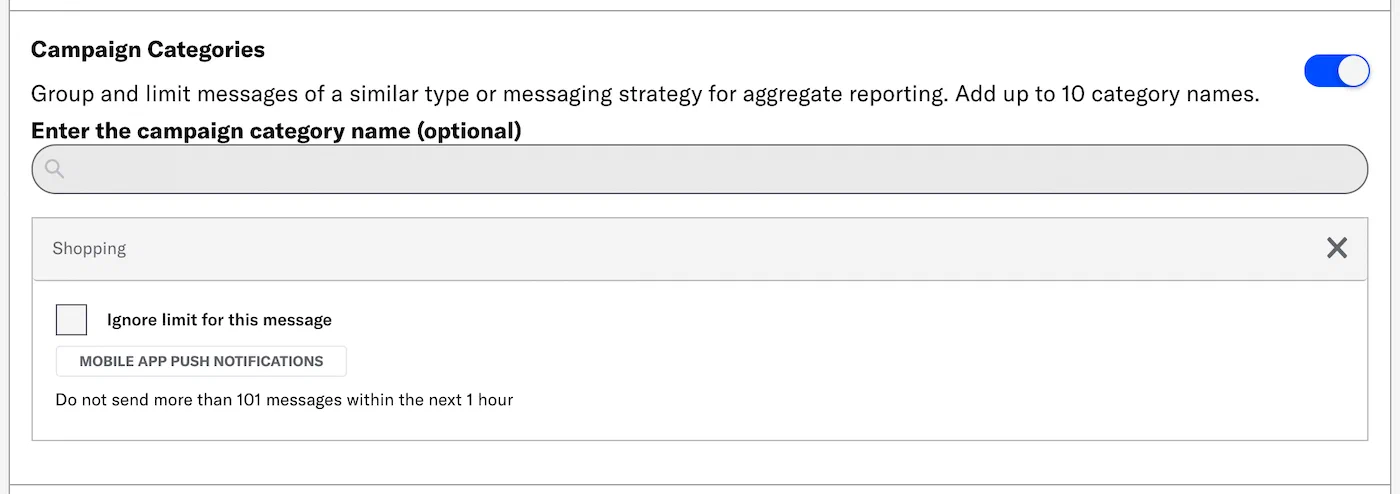 *Adding a campaign category that has a message limit* > **Tip:** Campaign categories are listed in the > [Message Detail](https://www.airship.com/docs/guides/reports/message/#message-detail) > section of Message Reports. ## Choose message priority {#message-priority} Assign a priority to ensure that your audience sees the highest priority messages first. *Message priority* determines the order in which messages appear to users; messages appear to the user in order from highest to lowest priority. Message priority is an integer between 1-100, where 1 is the highest priority, 100 the lowest. If a user receives two messages with the same priority, the more recently updated message appears first. Priority is shared across In-App Automations and Scenes. For example, you may have two messages configured to display on the next app open: an urgent account security warning, and a promotional marketing message. If you have assigned a high priority to the security warning and a lower priority to the marketing message, the higher priority message will appear first. Use the slider to set rough priorities, or look at the number value to make fine distinctions. > **Tip:** Setting a priority is useful because multiple messages can become > eligible for display at one time. > **Note:** Setting message priority does not guarantee one message will display before > another, because all other other conditions must be met for a message to become > eligible for display. Priority is available as a tiebreaker when you have > multiple messages ready for display. ## Custom keys {#custom-keys} *Custom keys* are additional key-value pairs in your push notification payload for use by custom code in your app or website. You can use custom keys to pass additional campaign identifiers for analytics, pass user information to the device, control the look and feel of the app, provide image links, etc. This option appears in Settings for Scenes only. For In-App Automation, [configure custom keys in the Content step](https://www.airship.com/docs/guides/messaging/in-app-experiences/in-app-automation/create/#content). Enter a key and value. Select **Add another** for additional keys. ## Override default missed behavior action {#missed-behavior} Override the [project-level setting](https://www.airship.com/docs/guides/messaging/project/enable-features/#setting-behavioral-defaults), specifying how the message is handled when audience conditions are not fully met. Select one of: * **Cancel:** The message cannot be displayed again on the device, even if the message is edited. * **Ignore:** The message will not count toward the display limit set in [Repeat this message](#repeat-this-message), and the waiting period will not apply. The trigger event must occur again before the message is eligible for redisplay. * **Increment:** The message will count toward the display limit set in [Repeat this message](#repeat-this-message), and the waiting period will apply. The trigger event must occur again before the message is eligible for redisplay. ## Ignore channel message limits Override the project-level [Message Limits](https://www.airship.com/docs/reference/glossary/#message_limits) to ensure that your audience will receive your message even if they've reached the message limit. You may want to override message limits for important information like breaking news, account alerts, or location proximity-based content. > **Note:** This option is present only when one or more multiple-channel message limits are set. ## Repeat this message Determine whether the message can be repeated a limited or unlimited amount of times and the minimum waiting period before it is eligible for redisplay. 1. Select **Limited number of displays** or **Unlimited number of displays**. 1. (For limited displays only) Enter the maximum number of times the message should be displayed. 1. Enter the minimum number of seconds, minutes, hours, or days that must elapse before a message becomes eligible for redisplay. > **Note:** * [Triggers](https://www.airship.com/docs/reference/glossary/#trigger_iaa) are not > monitored while a message is ineligible for display. The trigger event must > occur again *after the minimum time elapses* before the message will redisplay. > > For example, if you set the maximum number of displays to 3 and the minimum > time between displays to 1 week, the message will display a maximum of 3 times > and at most once per week. > > * For Scenes only, you can override Repeat by selecting *Dismiss and cancel Repeat* > when configuring a button's scene behavior or when configuring the Submit Responses button action. See [Button or Button Group](https://www.airship.com/docs/guides/messaging/editors/native/elements/#button-or-button-group) in *Content elements* and [Submit responses](https://www.airship.com/docs/guides/messaging/in-app-experiences/configuration/button-actions/#submit-responses) in *Actions for in-app experiences*. ## Specify start and end dates Set start and end dates and times during which your message can be displayed. Select a date, then select a time and time zone. # App Screens > Display in-app experiences when a user views a specific screen in your app or website. First, add an app screen in your project settings. Then you can configure a [Scene](https://www.airship.com/docs/reference/glossary/#scene) or [In-App Automation](https://www.airship.com/docs/reference/glossary/#iaa) to display when that screen is viewed. ## Requirements The screen must already exist in your mobile app or website. Ask your developer for the screen name as registered in your app or website code. You will enter the screen name in the **Unique ID** field when adding the screen to your project. See platform guides: * [Android Screen Tracking](https://www.airship.com/docs/developer/sdk-integration/android/analytics/#screen-tracking) * [iOS Screen Tracking](https://www.airship.com/docs/developer/sdk-integration/apple/analytics/#screen-tracking) * [Web Screen Tracking](https://www.airship.com/docs/developer/sdk-integration/web/analytics-and-reporting/#screen-tracking) ## Adding an app screen to your project Navigation to the settings differs depending on whether you have App or Web [Scenes](https://www.airship.com/docs/reference/glossary/#scene) enabled for your project. 1. Next to your project name, select the dropdown menu (▼), then **Settings**. 1. Under **App settings**, select **App & Web Screens**. 1. Select **Create App Screen** and enter: * **Unique ID** — The screen name from your app code. * **Description** — Extra information to help you identify this screen from the list of all app screens in your project. 1. Select **Save**. After creating app screens, you can edit or remove them from the list. Select the more menu icon (⋯) for a screen, and then select **Delete**, or select **Edit**, make your changes, and select **Save**. ## Using app screens with in-app experiences The Screenview trigger causes an In-App Automation or Scene to appear when your audience views a screen a specified number of times. See [Screenview](https://www.airship.com/docs/guides/messaging/in-app-experiences/configuration/triggers/#screenview) in our *In-app experience triggers* documentation. You can also set conditions that determine whether or not an in-app experience displays after a trigger event occurs. The message does not display until your conditions are met. See [In-app experience display conditions: Viewing a specific app screen](https://www.airship.com/docs/guides/messaging/in-app-experiences/configuration/triggers/#screenview-condition) in our *In-app experience triggers* documentation.