| Category | Description | Settings |
|---|---|---|
| Behavior | Set up what happens when audience conditions are not fully met. | See Missed Behavior in Setting behavioral defaults. |
| Properties | Name and define the colors and font families and sizes that you can select when configuring appearance defaults and when configuring the content of individual in-app experiences. | |
| Appearance | Pre-configure the design settings of new in-app experiences. You can override them in the composers. For [In-App Automation](https://www.airship.com/docs/reference/glossary/#iaa) defaults, set values for background, text, and buttons per message style: Banner, Modal, Fullscreen, and HTML. [Scene](https://www.airship.com/docs/reference/glossary/#scene) defaults are a mix of appearance and property defaults. Set default colors for the background, dismiss button, and indicators. Name and define view, text, input, and button styles that you can select when configuring appearance defaults and when configuring the content of individual Scenes. |
Edits are not applied to active messages that have already been triggered by a user. For instance, for a message configured to display when viewing a specific app screen, if you edit the message after the trigger event occurred for a user but before they have viewed the specific app screen, they will see the version of the message that does not contain your edits.
## Colors A *Color Set* is a named pair of hexadecimal color values supporting device Light and Dark modes. Color sets can be selected for any color field in a Scene and when configuring the default appearance of Scenes and In-App Automations. Dark mode is supported for Scenes only. To create color sets, see [Setting brand guidelines](https://www.airship.com/docs/guides/messaging/features/brand-guidelines/). ## Fonts When configuring the content of your in-app experiences, or when setting their defaults, you must set a *Font family* and a *Font size* for text, including button labels. For *Font family*, all projects contain a serif and a sans-serif font. You can also add custom fonts so your in-app experiences use the same fonts as the rest of your app. To set custom fonts, see [Setting brand guidelines](https://www.airship.com/docs/guides/messaging/features/brand-guidelines/). --- For *Font size* in Scenes, set a value when configuring text styles. You can then select a text style that applies to the default appearance of button labels and input fields. See [Set text, button, and input styles](#set-text-button-and-input-styles) in *Scene defaults* below. You also select text styles when [configuring Scene content](https://www.airship.com/docs/guides/messaging/in-app-experiences/configuration/content/). --- For *Font size* in In-App Automations, first define default font sizes: 1. Next to your project name, select the dropdown menu ( ), then **Settings**. 1. Under **App settings**, select **In-App Automation**. 1. For **Font Sizes**, enter a value in points for small, medium, and large sizes of **Header**, **Body**, **Footer**, and **Button** text. 1. Select **Save**. Next, select Small, Medium, or Large for the header, body, footer, and button **Font size** fields for each In-App Automation style. See [In-App Automation defaults](#setting-in-app-automation-defaults) below. You can override these settings when configuring text design in the Classic editor. See the [Design step](https://www.airship.com/docs/guides/messaging/in-app-experiences/in-app-automation/create/#design) in *Create an In-App Automation*. ## Scene defaults [AXP](https://www.airship.com/docs/reference/feature-packages/) Set default values for [Scene](https://www.airship.com/docs/reference/glossary/#scene) appearance and behaviors, including background colors, breakpoints, and styles for views, text, input fields, and buttons. A Scene's view determines whether it appears as fullscreen, a modal window, or [Embedded Content](https://www.airship.com/docs/reference/glossary/#embedded_content), along with other settings related to its type. Styles are collections of settings that determine the appearance of views, text, input fields, and buttons. You can select a style to apply all its settings at once. All projects contain preset styles you can rename, customize, and remove. You can also create custom styles. Requirements and behaviors for styles: * At least one style for each type is required, excluding Embedded Content view styles, which are optional. * If you remove a preset view style that is in use in your Scenes, the first view style in your list is applied to those Scenes. * Previously set hexadecimal color values appear until you create your first [color set](#colors) selection and save your changes. When configuring Background settings and view styles, the device preview updates as you type and make selections. Use the tools above the preview as you adjust settings: | Tool | Description | Steps | | --- | --- | --- | | **View** | For Background and Embedded Content view styles only. Determines which view style to preview. | Select a view style. | | **App/Web format** | This tool displays the Scene as it will appear in an app or website. The buttons only appear when both App and Web are enabled. | Select the grid icon for App or the globe icon for Web. | | **Orientation** | This tool shows how the Scene will appear when the device or monitor is rotated. | Toggle the orientation icon. | | **Light/Dark mode** | Shows the appearance of elements with an assigned [color set](#colors). Light Mode values appear in Dark Mode preview if no Dark Mode value was entered for a color set. | Toggle the selector. | | **Device/Screen size** | This tool provides a more accurate representation of how the Scene will appear on a specific screen size. | Select a device or screen size. | ### Set background Background settings apply to all new Scenes. 1. Next to your project name, select the dropdown menu ( ), then **Settings**. 1. Under **App settings**, select **Scenes**. 1. For **Background**, configure: | Field | Description | Steps | | --- | --- | --- | | **Background color** | The color of screen backgrounds. | Select a [color set](#colors). | | **Shade color** | The color of the device screen surrounding a modal Scene. Applies to all modal view styles. | Select a [color set](#colors). | | **Dismiss button color** | The color of the "X" button used to close the Scene. | Select a [color set](#colors). | | **Indicator colors** | The colors of the dots that indicate the number of screens and their active/inactive state in a multi-screen Scene. When Story mode is enabled, they are in the form of a progress bar that indicates the number of screens and their remaining duration. The Story mode progress bar is displayed using the inactive color only. | Select a [color set](#colors) for the active (current screen) and inactive states. | | **Breakpoints** | The width in pixels for Medium and Large device screen breakpoints for Web Scenes [as configured by your developer in the Web SDK](https://www.airship.com/docs/developer/sdk-integration/web/in-app-experiences/#screen-sizes-and-breakpoints). **These values are for preview purposes in the Airship dashboard only. They are not passed to a device.** | Enter a numeric value. | 1. Select **Save**. ### Set text, button, and input stylesThe styles for text, button, and input fields can be selected when configuring other default settings and when creating Scene content. Input styles control the appearance of the user input fields for the Email, SMS, Text Input, and Open Question content elements.
To set text, button, or input styles, see [Setting brand guidelines](https://www.airship.com/docs/guides/messaging/features/brand-guidelines/). ### Set fullscreen and modal view styles Each project supports up to 25 fullscreen and modal view styles and contains a preset of each, which you can edit or remove. To set the view styles: 1. Next to your project name, select the dropdown menu ( ), then **Settings**. 1. Under **App settings**, select **Scenes**. 1. Select **View Styles**. 1. Select the compose icon ( ) for an existing style or select ** Add view style**, and then configure: | Field | Description | Steps | | --- | --- | --- | | **Name** | A descriptive name for the style. The name appears in the list of all view styles in the Settings section of a Scene. | Enter text. | | **Orientation lock** | Forces the Scene to display in the set orientation when the device is rotated to another orientation. Options: Portrait, Landscape, None. | Select an orientation or **None**. | | **Position** | The vertical and horizontal position of the Scene relative to the device screen. Only apparent when Height and Width are set to less than 100%. You can set top, middle, or bottom for the vertical axis and left, middle, or right for the horizontal axis. The preset Modal default value is Middle. | Select a position. | | **Width** | The width of the Scene in pixels or as a percentage of the device screen window size. The preset Modal default value is 80%. | Enter a numeric value and select a value type of percentage or pixels. | | **Height** | The height of the Scene in pixels or as a percentage of the device screen window size. The preset Modal default value is 75%. | Enter a numeric value and select a value type of percentage or pixels. | | **Border color** | The color of the Scene border. Only apparent when Height and Width are set to less than 100%. | Select a [color set](#colors). | | **Border size** | The size of the Scene border in pixels. Only apparent when Height and Width are set to less than 100%. | Enter a numeric value. | | **Border radius** | Governs rounding the Scene's corners. Only apparent when Height and Width are set to less than 100%. For Top-positioned views, this applies to the bottom corners only. For Bottom-positioned views, this applies to the top corners only. The preset Modal default value is 0. | Enter an integer from 0 to 100. | | **Disable shade** | Removes the shade in a modal Scene so the website behind can be accessed. Supported for Web only. | Check the box disable the Shade. | 1. (Optional) Set [Conditional design overrides](https://www.airship.com/docs/guides/features/messaging/scenes/conditional-design-overrides/): 1. Select **Add override**. 1. Set the conditions that must be met for the overrides to apply: | Condition | Options and examples | | --- | --- | | **Orientation** | Portrait, Landscape, or Any | | **Size** | Small (most smartphones in landscape orientation), Medium (all smartphones), or Large (phablets and tablets) screen size or All | 1. (Optional) Select **Lock orientation** to display the Scene using your selected orientation even when the device is rotated. 1. Configure the values for the following that should apply when the override conditions are met: Position, Height, Width, Border color, Border size, Border radius, and Disable shade. 1. Select **Save** for the view style and overrides. 1. Select **Save** for your default settings. Select the trash can icon ( ) to remove a style. ### Set Embedded Content view styles [iOS SDK 18.7+](/docs/docs/developer/sdk-integration/apple/ios-changelog/#18.7.0) [Android SDK 18.1.4+](/docs/docs/developer/sdk-integration/android/changelog/#18.1.4) Each project supports up to 100 [Embedded Content](https://www.airship.com/docs/reference/glossary/#embedded_content) view styles. Understanding how Embedded Content sizing works can help ensure that it always fits within the intended area of your app or website and behaves predictably across devices and layouts. 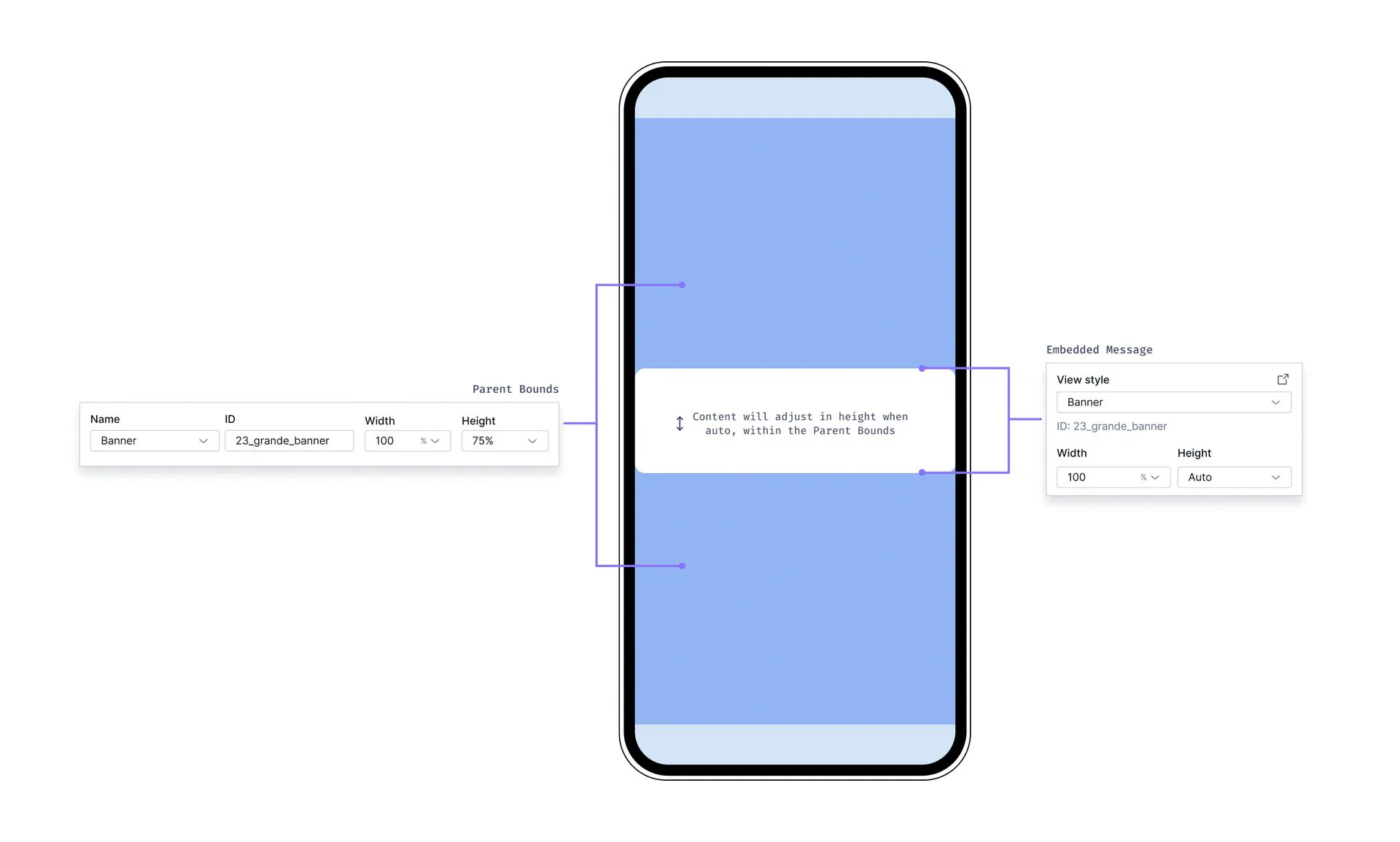 *Settings for Embedded Content view styles* **Parent bounds** When setting your Embedded Content view styles, you define the Parent Width and Parent Height. These settings are intended to match what was set by a developer in your app's code to represent your content more accurately in the Scene editor preview. While these dimensions are for preview purposes only, it is helpful to understand that they define the maximum space that your embedded content can occupy on the device screen. When editing content in a Scene, you can set margins that determine the spacing between the Scene and its parent bounds. See [Set the root appearance ](https://www.airship.com/docs/guides/messaging/in-app-experiences/configuration/content/#set-the-root-appearance) in *Configuring Scene content*. **Sizing behavior** - The maximum area available for your Embedded Content is determined by the Parent Bounds. - By default, the height of your Embedded Content is set to **Auto** and will adjust to fit the content within it. - You can override the default sizing by setting explicit Width and Height values in the settings panel when [setting the root appearance](https://www.airship.com/docs/guides/messaging/in-app-experiences/configuration/content/#set-the-root-appearance) of your scene. - Width cannot be set to **Auto**, it must be a percentage or pixel value. - Height cannot be set to **Auto** when the Embedded Content is part of a multi-screen embedded scene. However, you can manually set the height to a lower percentage. - If your embedded view is inside a `ScrollView` (as set in your app code), the content area will be scrollable. To set the view styles: 1. Next to your project name, select the dropdown menu ( ), then **Settings**. 1. Under **App settings**, select **Scenes**. 1. Locate an existing view style to edit or select ** Add view style**, and then configure: | Field | Description | Steps | | --- | --- | --- | | **Name** | A descriptive name for the style. The name appears in the list of all view styles in the Settings section of a Scene. | Enter text. | | **ID** | An identifier used to reference the Scene's content in your app's code. | Enter a value. | | **Description** | Text that describes the purpose of the style. | Enter text. | | **Parent width** | The Scene's width in pixels or as a percentage of the parent container's viewable area as determined by a developer in your app's code. **This value is for preview purposes in the Airship dashboard only. It is not passed to a device.** | Enter a numeric value and select a value type of percentage or pixels. | | **Parent height** | The Scene's height in pixels or as a percentage of the parent container's viewable area as determined by a developer in your app's code. **This value is for preview purposes in the Airship dashboard only. It is not passed to a device.** | Enter a numeric value and select a value type of percentage or pixels. | | **Border color** | The color of the Scene border. Only apparent when Parent height and width are set to less than 100%. | Select a [color set](#colors). | | **Border size** | The size of the Scene border in pixels. Only apparent when Parent height and width are set to less than 100%. | Enter a numeric value. | | **Border radius** | Governs rounding the Scene's corners. Only apparent when Parent height and width are set to less than 100%. [iOS SDK 19.6+](/docs/docs/developer/sdk-integration/apple/ios-changelog/#19.6.0) [Android SDK 19.9+](/docs/docs/developer/sdk-integration/android/changelog/#19.9.0) | Enter an integer from 0 to 100. | 1. Select **Save**. ## Setting In-App Automation defaults Set defaults for the background, text, and buttons in [In-App Automations](https://www.airship.com/docs/reference/glossary/#iaa). The settings are pre-configured when you create a new In-App Automation. See also [Colors](#colors) and [Fonts](#fonts) above. > **Note:** For In-App Automation, these defaults apply to the Classic editor only. You cannot set defaults for the Interactive/WYSIWYG editor. First, navigate to the settings: 1. Next to your project name, select the dropdown menu ( ), then **Settings**. 1. Under **App settings**, select **In-App Automation**. Next, manage the settings. Navigation differs depending on whether you have App or Web Scenes enabled for your project: 1. (If you do not have Scenes) Complete the remaining steps in the **Design** section. 1. (If you do have Scenes) Select **Styles**. 1. Configure each message style: Banner, Modal, Fullscreen, (Custom) HTML. See the [Field reference for In-App Automations](#field-reference-for-in-app-automations) for the fields and options per settings section for each message style. The device preview (not available for HTML) updates as you type and make selections. Previously set hexadecimal color values will appear until you create your first [color set](#colors) selection and save your changes. 1. Select **Save**. ### Setting transparent background While you can set the background to transparent in general, this information applies to modal In-App Automations only. Modal In-App Automations display within an HTML container that has a white background. You can eliminate the white background by setting the background color of the HTML style to transparent. 1. Next to your project name, select the dropdown menu ( ), then **Settings**. 1. Under **App settings**, select **In-App Automation**. 1. Select **Styles**, then **HTML**. 1. Enter `#00000000` for the background color. 1. Select **Save**. ## Field reference for In-App Automations Refer to these descriptions and configuration details when [setting defaults for In-App Automation styles](#setting-in-app-automation-defaults). Fields and options per settings section for each In-App Automation message style:| Settings | Banner | Modal | Fullscreen | HTML |
|---|---|---|---|---|
| Background |
|
|
|
Same as Modal |
| Text | Header and Body:
|
Same as Banner | Same as Banner, for Header, Body, and Footer | n/a |
| Buttons |
For two buttons:
|
Same as Banner | Same as Banner, for five buttons | n/a |