Root appearance
Configure appearance settings that apply to all screens, including dimensions, borders, shade, dismiss button, indicators, and navigation controls.
These appearance settings apply to all screens in your Scene content. Configure them by selecting the screens icon () in the left sidebar, and then selecting Root from the list of screens. Configure the settings in the right sidebar.
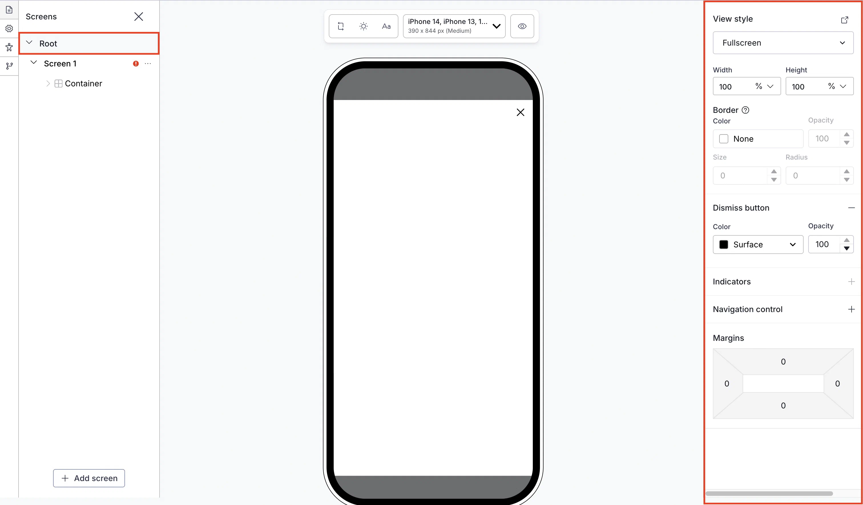
View style
First, select a view style defined in your project settings. To add or edit conditional design overrides, select the link icon () next to View style and follow step 5 in Set fullscreen and modal view styles in In-App Experience Defaults. The settings will apply to the current message only.
Next, configure its design properties. Where available, select the add icon () to enable a setting or the remove icon () to disable it. To set colors, select a color setA named pair of hexadecimal color values supporting device light and dark modes. Color sets can be selected for any color field in a Scene and when configuring the default appearance of Scenes and In-App Automations. Dark mode is supported for Scenes only. or enter a hexadecimal color value, and then enter an opacity percentage.
Automatically rank embedded content
AI iOS SDK 21+Android SDK 21+
For Embedded ContentAn alternative Scene format that can be displayed on any app or web screen in a view defined by a developer. It can also be presented as a story. view styles, rank Scenes queued for the same embedded view. On-device AI scores each candidate for relevance, based on the description and context you provide. The device displays whichever Scene scores highest.
For example, when a user is eligible for a loyalty offer, a re-engagement survey, and a content recommendation, Selection AI picks whichever is most relevant, instead of you having to decide.
This feature is supported for iOS and Android and requires app and Scene setup. In your app, your developer must link an AI model to use for evaluation. They can also register a context provider to supply additional real-time signals to the model. See On-Device AI for iOS or Android.
In your Scene, enable Selection AI and configure:
- Description — State what this Scene is and any conditions on when it should or shouldn’t apply, as plain facts for the model rather than persuasive copy. For example, “Credit card signup offer with 60k bonus points. Not for existing cardholders.”
- User context — Optional. Enter relevant facts about the viewer for the model to factor into its evaluation. For example, if the Scene targets specific users, you could enter “This Scene is only sent to users who purchase monthly.” The field also supports personalization using external data feedsA connection to an external API. When you send a message, Airship uses a response from that API to personalize messages. and attributesMetadata used for audience segmentation and personalization. Attributes extend the concept of tags by adding comparison operators and values to determine whether or not to target a user, helping you better evaluate your audience. in HandlebarsHandlebars is Airship’s templating language for personalization. Handlebars expressions use double curly braces wrapped around a content template, ranging from a simple variable, e.g.,
{{first_name}}, to complex evaluations of personalization data. syntax, such as{{is_cardholder}}or{{loyalty_tier}}. Airship sends resolved values to the model as additional context for ranking this content.
The context should not include health data, financial account numbers, government IDs, or other sensitive personal information.
Scenes follow your existing priority order until a model is linked, or if no candidate scores high enough for the model to make a selection.
Design properties
Configure design properties in the right sidebar after selecting a view style:
| Setting | Description |
|---|---|
| Width and Height | The width and height of the Scene in pixels or as a percentage of the screen size. |
| Border color and opacity | The color and transparency level of the Scene border. Only apparent when Height and Width are set to less than 100%. |
| Border size | The size of the Scene border in pixels. Only apparent when Height and Width are set to less than 100%. |
| Border radius (Embedded Content view styles) | Governs rounding the Scene’s corners. Only apparent when Height and Width are set to less than 100%. iOS SDK 19.6+Android SDK 19.9+ |
| Border radius (Modal and fullscreen view styles) | Governs rounding the Scene’s corners. Only apparent when Height and Width are set to less than 100%. For Top-positioned views, this applies to the bottom corners only. For Bottom-positioned views, this applies to the top corners only. |
| Shade color and opacity | Required for non-fullscreen Scenes. The color and transparency level of the device screen surrounding a non-fullscreen Scene. Overrides the default color. |
| Dismiss button | Optional. Determines the presence of the “X” button used to close the Scene. When enabled, you can override the default button color and opacity. |
| Indicators | Optional, for Scenes with multiple screens only, enabled by default. Determines the presence of the dots indicating the number of screens. When enabled, you can override the default colors of the active and inactive screens. Opacity determines the color transparency level. Indicators cannot be hidden when story mode is enabled, ensuring the appearance of the progress bar that indicates the number of screens and their remaining duration. The progress bar is displayed using the Inactive color only. The option is disabled when using custom HTML. |
| Navigation control | Optional. Displays left and right arrows for navigating between screens. This also supports navigation using keyboards and assistive technology. Set Background and Icon colors, Size and Alignment. iOS SDK 20.1+Android SDK 20.1.1+ |
| Play control | Optional. Displays a button to play or pause automatic screen transitions. If a screen contains background video, this control also pauses or resumes background video playback. It also adds support for control using keyboards and assistive technology. Available only when story mode is enabled. Set Background and Icon colors, Size and Alignment. iOS SDK 20.1+Android SDK 20.1.1+ |
| Margins (Embedded Content view styles) | Determines the spacing between the Scene and its parent bounds. Only apparent when Height and Width are set to less than 100%. See information about parent bounds in Set Embedded Content view styles in In-App Experience Defaults. |
| Margins (Modal and fullscreen view styles)1 | Determines the spacing between the Scene and the screen’s edges. Only apparent when Height and Width are set to less than 100%. Margins are applied in combination with the Position set for the view style. For example, for a modal Web Scene set to the bottom right position, set a margin to create a gap between the Scene and the window edges. To set a Position, see the View styles field reference in Setting Scene defaults. |
1. Setting both margins and a border in the same Scene requires minimum Android SDK 19.