# Root appearance
Configure appearance settings that apply to all screens, including dimensions, borders, shade, dismiss button, indicators, and navigation controls.
These appearance settings apply to all screens. Configure them during the Content step when [creating a Scene](https://www.airship.com/docs/guides/messaging/in-app-experiences/scenes/create/) by selecting the file icon () in the left sidebar, and then selecting **Root** from the list of screens. Configure the settings in the right sidebar.
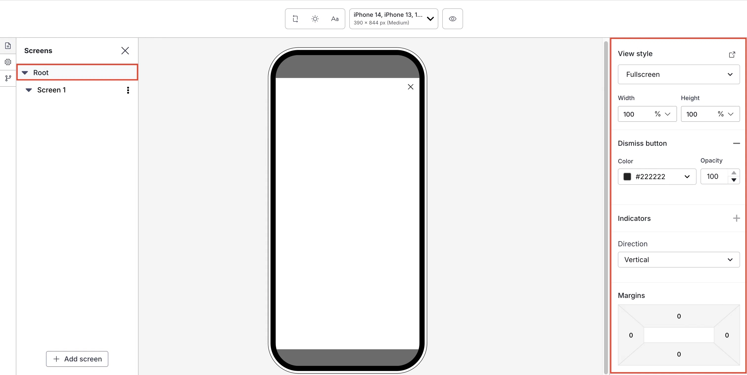
*Setting the root appearance for a Scene*
First, select a [view style defined in your project settings](https://www.airship.com/docs/guides/messaging/in-app-experiences/configuration/defaults/#scene-defaults).
To add or edit [conditional design overrides](https://www.airship.com/docs/guides/features/messaging/scenes/conditional-design-overrides/), select the external link icon (
) next to **View style** and follow step 5 in [Set fullscreen and modal view styles](https://www.airship.com/docs/guides/messaging/in-app-experiences/configuration/defaults/#set-fullscreen-and-modal-view-styles) in *In-App Experience Defaults*. The settings will apply to the current message only.
Next, configure design properties:
| Setting | Description | Steps |
| --- | --- | --- |
| **Width and Height** | The width and height of the Scene in pixels or as a percentage of the screen size. | Enter a numeric value and select a value type of percentage or pixels. |
| **Border color and opacity** | The color and transparency level of the Scene border. Only apparent when Height and Width are set to less than 100%. | Select a [Color Set](https://www.airship.com/docs/reference/glossary/#color_set) or enter a hexadecimal color value, and then set the opacity percentage. |
| **Border size** | The size of the Scene border in pixels. Only apparent when Height and Width are set to less than 100%. | Enter a numeric value. |
| **Border radius** (Embedded Content view styles) | Governs rounding the Scene's corners. Only apparent when height and width are set to less than 100%. [iOS SDK 19.6+](/docs/docs/developer/sdk-integration/apple/ios-changelog/#19.6.0) [Android SDK 19.9+](/docs/docs/developer/sdk-integration/android/changelog/#19.9.0) | Enter an integer from 0 to 100. |
| **Border radius** (Modal and fullscreen view styles) | Governs rounding the Scene's corners. Only apparent when Height and Width are set to less than 100%. For Top-positioned views, this applies to the bottom corners only. For Bottom-positioned views, this applies to the top corners only. | Enter an integer from 0 to 100. |
| **Shade color and opacity** | Required for non-fullscreen Scenes. The color and transparency level of the device screen surrounding a non-fullscreen Scene. Overrides the default color. | Select a [Color Set](https://www.airship.com/docs/reference/glossary/#color_set) or enter a hexadecimal color value, and then set the opacity percentage. |
| **Dismiss button** | Optional. Determines the presence of the "X" button used to close the Scene. When enabled, you can override the default color. Opacity determines the color transparency level. | Select the add icon () to enable. Select a [Color Set](https://www.airship.com/docs/reference/glossary/#color_set) or enter a hexadecimal color value for the button color, and then set the opacity percentage. Select the remove icon (
) to disable. |
| **Indicators** | Optional, for Scenes with multiple screens only, enabled by default. Determines the presence of the dots indicating the number of screens. When enabled, you can override the default colors of the active and inactive screens. Opacity determines the color transparency level.Indicators cannot be hidden when [Story mode](https://www.airship.com/docs/guides/messaging/editors/native/behaviors/#story-mode) is enabled, ensuring the appearance of the progress bar that indicates the number of screens and their remaining duration. The progress bar is displayed using the Inactive color only. The option is disabled when using custom HTML. | Select the add icon () to enable. Select a [Color Set](https://www.airship.com/docs/reference/glossary/#color_set) or enter a hexadecimal color value for Active and Inactive, and then set the opacity percentage. Select the remove icon (
) to disable. |
| **Navigation control** | Optional. Displays left and right arrows for navigating between screens. This also supports navigation using keyboards and assistive technology. [iOS SDK 20.1+](/docs/docs/developer/sdk-integration/apple/ios-changelog/#20.1.0) [Android SDK 20.1.1+](/docs/docs/developer/sdk-integration/android/changelog/#20.1.1) | Select the add icon () to enable. Select a [Color Set](https://www.airship.com/docs/reference/glossary/#color_set) or enter a hexadecimal color value for the Background and Icon colors, and then set the opacity percentage. Select Size and Alignment. Select the remove icon (
) to disable. |
| **Play control** | Optional. Displays a button to play or pause automatic screen transitions. If a screen contains background video, this control also pauses or resumes background video playback. It also adds support for control using keyboards and assistive technology. Available only when [Story mode](https://www.airship.com/docs/guides/messaging/editors/native/behaviors/#story-mode) is enabled. [iOS SDK 20.1+](/docs/docs/developer/sdk-integration/apple/ios-changelog/#20.1.0) [Android SDK 20.1.1+](/docs/docs/developer/sdk-integration/android/changelog/#20.1.1) | Select the add icon () to enable. Select a [Color Set](https://www.airship.com/docs/reference/glossary/#color_set) or enter a hexadecimal color value for the Background and Icon colors, and then set the opacity percentage. Select Size and Alignment. Select the remove icon (
) to disable. |
| **Direction** | Determines whether content elements within a screen are arranged vertically or stacked. Vertical arrangement enables scrolling. Stacking arranges elements on top of each other, front to back. The first added element is at the bottom of a stack (furthest back), and the last is on top (front). | Select a direction. To rearrange the order of stacked elements, select and hold the drag handle icon () for an element, then drag and drop to a new position. |
| **Margins** (Embedded Content view styles) | Determines the spacing between the Scene and its parent bounds. Only apparent when Height and Width are set to less than 100%. See information about parent bounds in [Set Embedded Content view styles](https://www.airship.com/docs/guides/messaging/in-app-experiences/configuration/defaults/#set-embedded-content-view-styles) in *In-App Experience Defaults*. | Enter a numeric value for each margin. |
| **Margins** (Modal and fullscreen view styles)1 | Determines the spacing between the Scene and the screen's edges. Only apparent when Height and Width are set to less than 100%.
Margins are applied in combination with the Position set for the view style. For example, for a modal Web Scene set to the bottom right position, set a margin to create a gap between the Scene and the window edges. To set a Position, see the [View styles field reference](https://www.airship.com/docs/guides/messaging/in-app-experiences/configuration/defaults/#view-styles) in *Setting Scene defaults*. | Enter a numeric value for each margin. |
1. Setting both margins and a border in the same Scene requires minimum Android SDK 19.