# In-App Experiences
Implement Scenes, In-App Automations, custom views, and embedded content to deliver engaging in-app experiences to your users.
# In-App Experiences
> Integrate Scenes & In-App Automations into your Android app to display embedded content and create custom in-app experiences with minimal code.
In-App Experiences use Airship's on-device automation framework to provide instant, personalized content that integrates natively with your app. This includes [Scenes](https://www.airship.com/docs/reference/glossary/#scene), which can be displayed as modal or fullscreen overlays or embedded directly within your app screens, and In-App Automations (IAA), which power banner, modal, and fullscreen in-app messages triggered by events.
Scenes are fully customizable in the Airship dashboard and require minimal SDK integration. For advanced In-App Automation customization options, see [In-App Automation](https://www.airship.com/docs/developer/sdk-integration/android/in-app-experiences/in-app-automation/).
## Requirements
To use In-App Experiences, you need:
- The `urbanairship-automation` module installed (see [Getting Started](https://www.airship.com/docs/developer/sdk-integration/android/installation/getting-started/))
- Airship SDK initialized (see [Getting Started](https://www.airship.com/docs/developer/sdk-integration/android/installation/getting-started/))
> **Note:** **In-App Experiences work out of the box**: Once you install the `urbanairship-automation` module and initialize Airship, In-App Experiences will function automatically. The rest of this documentation covers optional customization and advanced features.
## Controlling display
Control when and how In-App Experiences are displayed in your app. You can auto-pause displays on launch (useful for splash screens), manually pause all in-app displays, set intervals between displays, and control when individual messages are ready to display.
### Auto-pausing on launch
For apps with splash screens, you can configure Airship to automatically pause In-App Automation on launch. This prevents In-App Experiences from displaying during the splash screen. Once your app is ready, resume display by setting `isPaused` to `false`.
Set the `autoPauseInAppAutomationOnLaunch` option in your Airship config when building `AirshipConfigOptions` (in your Autopilot's `createAirshipConfigOptions` or in `airshipconfig.properties` as `auto_pause_in_app_automation_on_launch = true`):
#### Kotlin
```kotlin
override fun createAirshipConfigOptions(context: Context) =
airshipConfigOptions {
// ... other config settings ...
// Auto-pause on launch for splash screen
setAutoPauseInAppAutomationOnLaunch(true)
}
```
When your splash screen is dismissed and the app is ready, resume display:
```kotlin
InAppAutomation.shared().isPaused = false
```
#### Java
```java
@Override
public AirshipConfigOptions createAirshipConfigOptions(Context context) {
return AirshipConfigOptions.newBuilder()
// ... other config settings ...
// Auto-pause on launch for splash screen
.setAutoPauseInAppAutomationOnLaunch(true)
.build();
}
```
When your splash screen is dismissed and the app is ready, resume display:
```java
InAppAutomation.shared().setPaused(false);
```
### Pausing display
Pausing will still allow In-App Experiences to be triggered and queued up
for execution, but they will not display. This is useful for preventing in-app experiences from
displaying on screens where it would be detrimental to the user experience,
such as splash screens, settings screens, or landing pages.
#### Kotlin
```kotlin
InAppAutomation.shared().isPaused = true
```
#### Java
```java
InAppAutomation.shared().setPaused(true);
```
### Display interval
The display interval controls the amount of time to wait before the manager can display the next triggered In-App Experience. The default value is set to **0 seconds** and can be adjusted to any amount of time in seconds.
#### Kotlin
```kotlin
InAppAutomation.shared().inAppMessaging.displayInterval = 30
```
#### Java
```java
InAppAutomation.shared().getInAppMessaging().setDisplayInterval(30);
```
### Controlling per-message display
You can control when individual In-App Experiences are ready to display and listen for when they are displayed or finished. This is useful when you need to check app state before displaying content, such as:
- Verifying the current Activity is appropriate for the message
- Checking custom data in the message's extras (custom keys) to determine if it should display
- Ensuring certain app conditions are met before showing the message
- Integrating with other in-app messaging products
#### Kotlin
Set a delegate to control the display. You have access to the message and schedule ID:
```kotlin
InAppAutomation.shared().inAppMessaging.displayDelegate = object : InAppMessageDisplayDelegate {
override fun isMessageReadyToDisplay(message: InAppMessage, scheduleId: String): Boolean {
// Return false to prevent display
return false
}
override fun messageWillDisplay(message: InAppMessage, scheduleId: String) {
// Message displayed
}
override fun messageFinishedDisplaying(message: InAppMessage, scheduleId: String) {
// Message finished
}
}
```
`isMessageReadyToDisplay` will be called whenever state in the app changes (Activity, app state, message finished displaying, etc...), you can also trigger it manually with `notifyDisplayConditionsChanged`:
```kotlin
InAppAutomation.shared().inAppMessaging.notifyDisplayConditionsChanged()
```
#### Java
Implement the `InAppMessageDisplayDelegate` to control the display. You have access to the message and schedule ID:
**Implement the InAppMessageDisplayDelegate**
```java
InAppAutomation.shared().getInAppMessaging().setDisplayDelegate(new InAppMessageDisplayDelegate() {
@Override
public boolean isMessageReadyToDisplay(@NonNull InAppMessage message, @NonNull String scheduleId) {
// Return false to prevent display
return false;
}
@Override
public void messageWillDisplay(@NonNull InAppMessage message, @NonNull String scheduleId) {
// Message displayed
}
@Override
public void messageFinishedDisplaying(@NonNull InAppMessage message, @NonNull String scheduleId) {
// Message finished
}
});
```
`isMessageReadyToDisplay` will be called whenever state in the app changes (Activity, app state, message finished displaying, etc...), you can also trigger it manually with `notifyDisplayConditionsChanged`:
```java
InAppAutomation.shared().getInAppMessaging().notifyDisplayConditionsChanged();
```
## Next steps
- Learn how to [create Scenes in the Airship dashboard](https://www.airship.com/docs/guides/messaging/in-app-experiences/scenes/create/)
- Present Scene content with [Embedded Content](https://www.airship.com/docs/developer/sdk-integration/android/in-app-experiences/embedded-content/)
- Create reusable components with [Custom Views](https://www.airship.com/docs/developer/sdk-integration/android/in-app-experiences/custom-views/)
- Customize [In-App Automation](https://www.airship.com/docs/developer/sdk-integration/android/in-app-experiences/in-app-automation/) for IAA
# Embedded Content
> Integrate Embedded Content into your Android app to display Scene content directly within your app's screens.
For information about Embedded Content, including overview, use cases, and how to create Embedded Content view styles and Scenes, see [Embedded Content](https://www.airship.com/docs/guides/features/messaging/scenes/embedded-content/).
You can set up Embedded Content for Android using Jetpack Compose or XML Views. If you are not already on Android SDK 18.1.4+, see the [Airship Android SDK 17.x to 18.0 migration guide](https://github.com/urbanairship/android-library/blob/18.0.0/documentation/migration/migration-guide-17-18.md).
## Jetpack Compose setup
Embedded Content support for Jetpack Compose is provided by an extension library, which must be declared as a
dependency of your project.
#### Gradle Kotlin
**app build.gradle.kts**
```kotlin
dependencies {
val airshipVersion = "androidSdkVersion"
// Other Airship dependencies...
implementation("com.urbanairship.android:urbanairship-automation-compose:$airshipVersion")
}
```
> **Note:** All Airship dependencies included in the `build.gradle.kts` file should all specify the exact same version.
#### Gradle Groovy
**app build.gradle**
```groovy
dependencies {
def airshipVersion = "androidSdkVersion"
// Other Airship dependencies...
implementation "com.urbanairship.android:urbanairship-automation-compose:$airshipVersion"
}
```
> **Note:** All Airship dependencies included in the `build.gradle` file should all specify the exact same version.
### Adding an AirshipEmbeddedView
The `AirshipEmbeddedView` is a Composable UI element that defines a place for Airship Embedded Content to be displayed. When defining an `AirshipEmbeddedView`, specify the `embeddedId` for the content it should display. The value of the `embeddedId` must be the ID of an Embedded Content view style in your project.
**Basic integration**
```kotlin
import com.urbanairship.automation.compose.AirshipEmbeddedView
@Composable
fun HomeScreenBanner() {
// Show any "home_banner" Embedded Content
AirshipEmbeddedView(
embeddedId = "home_banner",
modifier = Modifier.fillMaxWidth().height(300.dp)
)
}
```
### Placeholders
If no content is available to display, the embedded view can optionally show a placeholder. The placeholder can be configured by providing a composable lambda that defines the placeholder content.
If no placeholder is set, the embedded view will use the default behavior:
- If content is available for the `embeddedId`, the `AirshipEmbeddedView` will display it within your composition.
- If no content is available for the `embeddedId`, the `AirshipEmbeddedView` will not be visible.
- Compose previews will show a default placeholder that displays the `embeddedId`.
**Basic integration with placeholder**
```kotlin
AirshipEmbeddedView(
embeddedId = "home_banner",
modifier = Modifier.fillMaxWidth().wrapContentHeight()
) {
Text("Placeholder!", Modifier.align(Alignment.Center))
}
```
### Placing in a Scrolling Container
When placed directly in a scrolling Composable, or in a nested Composable within the scrolling parent that is not bounded in
the scroll direction, you must provide the parent's size for the corresponding dimension of the embedded view. This enables
percent-based sizing to work correctly. A simple way to accomplish this is to use the `onSizeChanged` modifier to store
the size of the scrolling parent (or another ancestor) so that the size can be passed to the embedded view via the
`parentWidthProvider` or `parentHeightProvider` arguments.
**verticalScroll modifier example**
```kotlin
val scrollState = rememberScrollState()
var parentHeight by remember { mutableIntStateOf(0) }
Column(
modifier = Modifier.fillMaxSize()
.onSizeChanged { parentHeight = it.height }
.verticalScroll(scrollState)
) {
AirshipEmbeddedView(
embeddedId = "home_banner",
parentHeightProvider = { parentHeight },
modifier = Modifier.fillMaxWidth()
)
// ...
}
```
### Placing in a Lazy Container
An approach similar to the [above method](#placing-in-a-scrolling-container) can be used for sizing embedded views inside of Lazy scrolling containers, such as `LazyColumn` or `LazyRow`. It's important to remember to hoist the embedded view state above the Lazy container so that the embedded view can be recycled and re-created properly. You can do this by calling `rememberAirshipEmbeddedViewState` and passing the embedded view ID as an argument, which returns an embedded view state-holder instance for the given `embeddedId`.
In the example below, you'll notice that the `AirshipEmbeddedView` call doesn't include an `embeddedId` argument. This is because the `embeddedId` is provided by the remembered `AirshipEmbeddedViewState` instance.
**Lazy scrolling example**
```kotlin
val lazyListState = rememberLazyListState()
// Hoist the embedded state above the LazyColumn.
val embeddedViewState = rememberAirshipEmbeddedViewState(embeddedId = "home_banner")
var parentHeight by remember { mutableIntStateOf(0) }
LazyColumn(
state = lazyListState,
modifier = Modifier.fillMaxSize()
.onSizeChanged { parentHeight = it.height }
) {
item {
AirshipEmbeddedView(
// The embeddedId of "home_banner" from embeddedViewState
// will be used by the embedded view.
state = embeddedViewState,
parentHeightProvider = { parentHeight },
modifier = Modifier.fillMaxWidth()
)
}
// ...
}
```
## XML Views setup
You can use XML Views instead of [Jetpack Compose](#jetpack-compose-setup).
### Adding an AirshipEmbeddedView
The `AirshipEmbeddedView` is an Android `View` that defines a place for Airship Embedded Content to be
displayed.
When defining an `AirshipEmbeddedView`, specify the `airshipEmbeddedId` for the content it should display. The value of the `embeddedId` must be the ID of an Embedded Content view style in your project.
**Basic integration**
```xml
```
### Placeholders
If no content is available to display, the embedded view can optionally show a placeholder. The placeholder can be configured by providing a reference to an XML layout that defines the placeholder content. If no placeholder is set, the embedded view will use the default behavior:
- If content is available for the `airshipEmbeddedId`, the `AirshipEmbeddedView` will display it within your layout.
- If no content is available for the `airshipEmbeddedId`, the `AirshipEmbeddedView` will not be visible.
**Basic integration with placeholder**
```xml
```
### Placing in a ScrollView or RecyclerView
When placed directly in a `ScrollView` or `RecyclerView`, or as a nested child view within a scrolling view that is not bounded in
the scroll direction, you must provide the parent's size for the corresponding dimension of the embedded view. This enables
percent-based sizing to work correctly. You'll need to determine the container size of the
scrolling parent (or another ancestor) and pass the size to the embedded view via the
`parentWidthProvider` or `ParentHeightProvider` arguments.
**ScrollView example**
```kotlin
override fun onViewCreated(view: View, savedInstanceState: Bundle?) {
val scrollView = findViewById(R.id.scroll_view)
val embeddedView = findViewById(R.id.home_banner_embedded_view)
scrollView.doOnPreDraw {
embeddedView.parentHeightProvider = { scrollView.height }
}
}
```
Use with `RecyclerView` is similar to the above example, but you'll need to set the parent size in the `onBindViewHolder` method.
One way to accomplish this is to pass the parent size to the adapter so that it can be used when binding the view holder
that contains the embedded view.
## Controlling content display order
By default, pending Embedded Content is displayed in First In, First Out (FIFO) order per `embeddedId`.
If you want to control the order in which pending content is displayed, you can provide a custom `Comparator`
to sort the Embedded Content based on fields that you define in the content's extras.
#### Compose
```kotlin
AirshipEmbeddedView(
embeddedId = "home_banner",
comparator = { a, b ->
// Compare based on the priority field set on the Embedded Content extras.
val priorityA = a.extras.opt("priority").getInt(0)
val priorityB = b.extras.opt("priority").getInt(0)
priorityA.compareTo(priorityB)
},
modifier = Modifier.fillMaxWidth()
)
```
A `Comparator` can also be passed as an argument to `rememberAirshipEmbeddedViewState` to control content display order when hoisting the embedded view state.
#### XML View
```kotlin
override fun onViewCreated(view: View, savedInstanceState: Bundle?) {
val embeddedView = findViewById(R.id.home_banner_embedded_view)
embeddedView.comparator = Comparator { a, b ->
// Compare based on the priority field set on the Embedded Content extras.
val priorityA = a.extras.opt("priority").getInt(0)
val priorityB = b.extras.opt("priority").getInt(0)
priorityA.compareTo(priorityB)
}
}
```
## Observing available Embedded Content
Embedded Content is not always available, and even after being triggered, it still needs to be prepared before it can be displayed. An `AirshipEmbeddedView` will automatically update when content is available and transition from the placeholder to the content once content is available. If you need to query the availability of Embedded Content, you can use an `AirshipEmbeddedObserver` to watch for updates.
An `AirshipEmbeddedObserver` exposes both a callback and a `Flow` that can be used to receive updates about the
availability of Embedded Content. This allows for more dynamic handling of Embedded Content than just content
or a placeholder.
#### Kotlin
**Flow usage**
```kotlin
val observer = AirshipEmbeddedObserver("playground")
val embeddedInfo = observer.embeddedViewInfoFlow.collectAsState(initial = emptyList())
if (embeddedInfo.value.isEmpty()) {
Text("No banner available")
} else {
Text("Banner available")
AirshipEmbeddedView(embeddedId = "home_banner")
}
```
#### Java
**Callback usage**
```java
AirshipEmbeddedObserver observer = new AirshipEmbeddedObserver("home_banner");
observer.setListener(new AirshipEmbeddedObserver.Listener() {
@Override
public void onEmbeddedViewInfoUpdate(@NonNull List views) {
if (views.isEmpty()) {
textView.setText("No banner available");
embeddedView.setVisibility(View.GONE);
} else {
textView.setText("Banner available");
embeddedView.setVisibility(View.VISIBLE);
}
}
});
```
The `AirshipEmbeddedObserver` can be created to watch for one or more `embeddedId` values or use custom
filtering to watch all Embedded Content or a subset determined by inspecting the `embeddedId` or
`extras` associated with the Embedded Content. The `embeddedInfos` returned by the callback or `Flow`
are in FIFO order, meaning that the first content in the list is the first content that will be displayed.
# Custom Views
> Register custom Android views with the AirshipCustomViewManager to use them in Scenes.
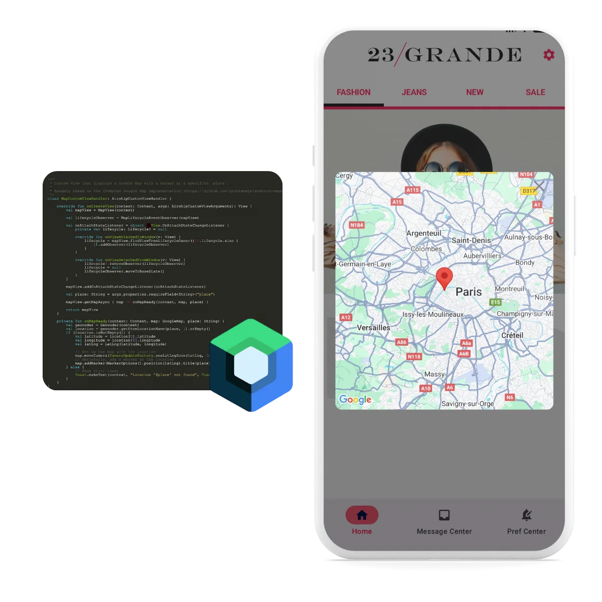
*Custom View rendered in a Scene on Android*
To use Custom Views, you must first register the view's name with the `AirshipCustomViewManager`. The name is referenced when adding the Custom View to a Scene.
The view manager will call through to the
view builders registered for that view's name and provide the properties, name, and some layout hints as arguments.
All Custom Views should be registered during the [onAirshipReady callback](https://www.airship.com/docs/developer/sdk-integration/android/installation/getting-started/#customizing-airship) to ensure the view is available before a Scene is rendered.
#### Kotlin
```kotlin
// Return an Android View
AirshipCustomViewManager.register("my-custom-view") { context, args ->
TextView(context).apply {
text = args.properties.optionalField("text") ?: "Fallback"
}
}
// For compose, use a ComposeView
AirshipCustomViewManager.register("my-custom-view") { context, args ->
ComposeView(context).apply {
setContent {
MaterialTheme {
Text(args.properties.optionalField("text") ?: "Fallback")
}
}
}
}
```
#### Java
```java
// Return an Android View
AirshipCustomViewManager.register("my-custom-view", (context, args) -> {
TextView textView = new TextView(context);
String text = args.getProperties().optionalField(String.class, "text");
textView.setText(text != null ? text : "Fallback");
return textView;
});
// For compose, use a ComposeView
AirshipCustomViewManager.register("my-custom-view", (context, args) -> {
ComposeView composeView = new ComposeView(context);
String text = args.getProperties().optionalField(String.class, "text");
composeView.setContent(content -> {
MaterialTheme.INSTANCE.invoke(content, theme -> {
Text.INSTANCE.invoke(text != null ? text : "Fallback");
});
});
return composeView;
});
```
## Example custom view
The following example shows a Custom View that renders an embedded map when
called to render a Custom View named `map`.
In our example, we have `properties` that defines a single `place` field, which is the address of the location that the map should render.
#### Kotlin
First, define the view handler:
```kotlin
/**
* Custom View that displays a Google Map with a marker at a specified `place`.
*
* Roughly based on the [Compose Google Map implementation](https://github.com/googlemaps/android-maps-compose/blob/main/maps-compose/src/main/java/com/google/maps/android/compose/GoogleMap.kt)
*/
class MapCustomViewHandler: AirshipCustomViewHandler {
override fun onCreateView(context: Context, args: AirshipCustomViewArguments): View {
val mapView = MapView(context)
val lifecycleObserver = MapLifecycleEventObserver(mapView)
val onAttachStateListener = object : View.OnAttachStateChangeListener {
private var lifecycle: Lifecycle? = null
override fun onViewAttachedToWindow(v: View) {
lifecycle = mapView.findViewTreeLifecycleOwner()!!.lifecycle.also {
it.addObserver(lifecycleObserver)
}
}
override fun onViewDetachedFromWindow(v: View) {
lifecycle?.removeObserver(lifecycleObserver)
lifecycle = null
lifecycleObserver.moveToBaseState()
}
}
mapView.addOnAttachStateChangeListener(onAttachStateListener)
val place: String = args.properties.requireField("place")
mapView.getMapAsync { map -> onMapReady(context, map, place) }
return mapView
}
private fun onMapReady(context: Context, map: GoogleMap, place: String) {
val geocoder = Geocoder(context)
val location = geocoder.getFromLocationName(place, 1).orEmpty()
if (location.isNotEmpty()) {
val latitude = location[0].latitude
val longitude = location[0].longitude
val latLng = LatLng(latitude, longitude)
// Set up the map with the location
map.moveCamera(CameraUpdateFactory.newLatLngZoom(latLng, 10f))
// Optionally, add a marker at the location
map.addMarker(MarkerOptions().position(latLng).title(place))
} else {
// Show error toast
Toast.makeText(context, "Location '$place' not found", Toast.LENGTH_SHORT).show()
}
}
}
/**
* A [LifecycleEventObserver] that manages the lifecycle of a [MapView].
*
* This is used to ensure that the [MapView] is properly managed by the Android lifecycle.
*/
private class MapLifecycleEventObserver(private val mapView: MapView) : LifecycleEventObserver {
private var currentLifecycleState: Lifecycle.State = Lifecycle.State.INITIALIZED
override fun onStateChanged(source: LifecycleOwner, event: Lifecycle.Event) {
when (event) {
// [mapView.onDestroy] is only invoked from AndroidView->onRelease.
Lifecycle.Event.ON_DESTROY -> moveToBaseState()
else -> moveToLifecycleState(event.targetState)
}
}
/**
* Move down to [Lifecycle.State.CREATED] but only if [currentLifecycleState] is actually above that.
* It's theoretically possible that [currentLifecycleState] is still in [Lifecycle.State.INITIALIZED] state.
* */
fun moveToBaseState() {
if (currentLifecycleState > Lifecycle.State.CREATED) {
moveToLifecycleState(Lifecycle.State.CREATED)
}
}
fun moveToDestroyedState() {
if (currentLifecycleState > Lifecycle.State.INITIALIZED) {
moveToLifecycleState(Lifecycle.State.DESTROYED)
}
}
private fun moveToLifecycleState(targetState: Lifecycle.State) {
while (currentLifecycleState != targetState) {
when {
currentLifecycleState < targetState -> moveUp()
currentLifecycleState > targetState -> moveDown()
}
}
}
private fun moveDown() {
val event = Lifecycle.Event.downFrom(currentLifecycleState)
?: error("no event down from $currentLifecycleState")
invokeEvent(event)
}
private fun moveUp() {
val event = Lifecycle.Event.upFrom(currentLifecycleState)
?: error("no event up from $currentLifecycleState")
invokeEvent(event)
}
private fun invokeEvent(event: Lifecycle.Event) {
when (event) {
Lifecycle.Event.ON_CREATE -> mapView.onCreate(Bundle())
Lifecycle.Event.ON_START -> mapView.onStart()
Lifecycle.Event.ON_RESUME -> mapView.onResume()
Lifecycle.Event.ON_PAUSE -> mapView.onPause()
Lifecycle.Event.ON_STOP -> mapView.onStop()
Lifecycle.Event.ON_DESTROY -> mapView.onDestroy()
else -> error("Unsupported lifecycle event: $event")
}
currentLifecycleState = event.targetState
}
}
```
Then register the view:
```kotlin
AirshipCustomViewManager.register("map", MapCustomViewHandler())
```
#### Java
First, define the view handler:
```java
/**
* Custom View that displays a Google Map with a marker at a specified place.
*/
public class MapCustomViewHandler implements AirshipCustomViewHandler {
@Override
public View onCreateView(@NonNull Context context, @NonNull AirshipCustomViewArguments args) {
MapView mapView = new MapView(context);
String place = args.getProperties().requireField(String.class, "place");
mapView.getMapAsync(map -> onMapReady(context, map, place));
return mapView;
}
private void onMapReady(Context context, GoogleMap map, String place) {
Geocoder geocoder = new Geocoder(context);
try {
List addresses = geocoder.getFromLocationName(place, 1);
if (!addresses.isEmpty()) {
Address address = addresses.get(0);
LatLng latLng = new LatLng(address.getLatitude(), address.getLongitude());
map.moveCamera(CameraUpdateFactory.newLatLngZoom(latLng, 10f));
map.addMarker(new MarkerOptions().position(latLng).title(place));
} else {
Toast.makeText(context, "Location '" + place + "' not found", Toast.LENGTH_SHORT).show();
}
} catch (IOException e) {
Toast.makeText(context, "Error geocoding: " + e.getMessage(), Toast.LENGTH_SHORT).show();
}
}
}
```
Then register the view:
```java
AirshipCustomViewManager.register("map", new MapCustomViewHandler());
```
## Scene Control
Custom views control their parent scene through the `SceneController`, which is provided in `AirshipCustomViewArguments`.
### Accessing SceneController
Access the scene controller via `args.sceneController` in your view handler's `onCreateView` method.
#### Kotlin
```kotlin
class CustomViewHandler : AirshipCustomViewHandler {
override fun onCreateView(context: Context, args: AirshipCustomViewArguments): View {
// Access via args.sceneController
args.sceneController.dismiss()
return yourView
}
}
```
#### Java
```java
public class CustomViewHandler implements AirshipCustomViewHandler {
@Override
public View onCreateView(@NonNull Context context, @NonNull AirshipCustomViewArguments args) {
// Access via args.getSceneController()
args.getSceneController().dismiss();
return yourView;
}
}
```
### Dismissing scenes
Call `dismiss()` to close the scene, or set `cancelFutureDisplays` to prevent it from displaying again.
#### Kotlin
```kotlin
// Simple dismiss
args.sceneController.dismiss()
// Dismiss and cancel future displays
args.sceneController.dismiss(cancelFutureDisplays = true)
```
#### Java
```java
// Simple dismiss
args.getSceneController().dismiss();
// Dismiss and cancel future displays
args.getSceneController().dismiss(true);
```
### Pager navigation
Navigate between pages using `navigate()`, which returns `true` if navigation succeeded.
#### Kotlin
```kotlin
// Navigate forward or backward
args.sceneController.pager.navigate(NavigationRequest.NEXT)
args.sceneController.pager.navigate(NavigationRequest.BACK)
// Check if navigation succeeded
val success = args.sceneController.pager.navigate(NavigationRequest.NEXT)
```
#### Java
```java
// Navigate forward or backward
args.getSceneController().getPager().navigate(NavigationRequest.NEXT);
args.getSceneController().getPager().navigate(NavigationRequest.BACK);
// Check if navigation succeeded
boolean success = args.getSceneController().getPager().navigate(NavigationRequest.NEXT);
```
Observe the pager's `StateFlow` to check current navigation state and enable/disable navigation UI.
#### Kotlin
```kotlin
// Compose
val state = args.sceneController.pager.state.collectAsState()
if (state.value.canGoNext) {
// Can navigate forward
}
// View-based
lifecycleScope.launch {
args.sceneController.pager.state.collect { state ->
// Update UI based on state.canGoBack and state.canGoNext
}
}
```
#### Java
```java
LifecycleOwner lifecycleOwner = // get from context
CoroutineScope scope = LifecycleScopeKt.getLifecycleScope(lifecycleOwner);
FlowKt.launchIn(
FlowKt.onEach(args.getSceneController().getPager().getState(), state -> {
// Update UI based on state.getCanGoBack() and state.getCanGoNext()
return Unit.INSTANCE;
}),
scope
);
```
### Sizing management
Use `args.sizeInfo` to determine appropriate sizing for your custom view.
#### Kotlin
```kotlin
// Compose
val modifier = when {
args.sizeInfo.isAutoWidth && args.sizeInfo.isAutoHeight -> Modifier.wrapContentSize()
args.sizeInfo.isAutoWidth -> Modifier.wrapContentWidth().fillMaxHeight()
args.sizeInfo.isAutoHeight -> Modifier.fillMaxWidth().wrapContentHeight()
else -> Modifier.fillMaxSize()
}
// View-based
val width = if (args.sizeInfo.isAutoWidth) {
ViewGroup.LayoutParams.WRAP_CONTENT
} else {
ViewGroup.LayoutParams.MATCH_PARENT
}
val height = if (args.sizeInfo.isAutoHeight) {
ViewGroup.LayoutParams.WRAP_CONTENT
} else {
ViewGroup.LayoutParams.MATCH_PARENT
}
```
#### Java
```java
// View-based
int width = args.getSizeInfo().isAutoWidth()
? ViewGroup.LayoutParams.WRAP_CONTENT
: ViewGroup.LayoutParams.MATCH_PARENT;
int height = args.getSizeInfo().isAutoHeight()
? ViewGroup.LayoutParams.WRAP_CONTENT
: ViewGroup.LayoutParams.MATCH_PARENT;
```
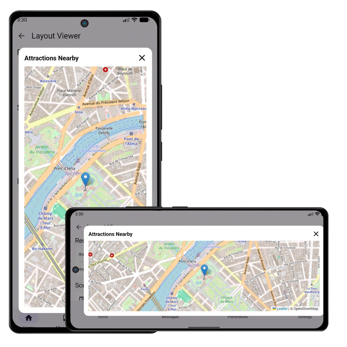
*Map Custom View in a Scene on Android*
## Embedding Airship Views
Airship views like Preference Center can be embedded as custom views.
#### Kotlin
```kotlin
import com.urbanairship.preferencecenter.compose.ui.PreferenceCenterContent
import com.urbanairship.preferencecenter.compose.ui.PreferenceCenterScreen
import com.urbanairship.preferencecenter.ui.PreferenceCenterFragment
// Compose - Content only (no navigation bar)
AirshipCustomViewManager.register("preference_center_content") { context, args ->
val id = args.properties.opt("id").optString()
ComposeView(context).apply {
setContent {
PreferenceCenterContent(
identifier = id,
modifier = Modifier.fillMaxSize()
)
}
}
}
// Compose - Full preference center with navigation bar
AirshipCustomViewManager.register("preference_center") { context, args ->
val id = args.properties.opt("id").optString()
ComposeView(context).apply {
setContent {
PreferenceCenterScreen(
identifier = id,
modifier = Modifier.fillMaxSize(),
onNavigateUp = { args.sceneController.dismiss() }
)
}
}
}
// View - Content only (no navigation bar)
AirshipCustomViewManager.register("preference_center_content") { context, args ->
val id = args.properties.opt("id").optString()
val activity = context as? FragmentActivity ?: throw IllegalStateException("Context must be FragmentActivity")
FrameLayout(context).apply {
id = View.generateViewId()
activity.supportFragmentManager.beginTransaction()
.add(id, PreferenceCenterFragment.create(id))
.commitNow()
}
}
// View - Full preference center with navigation bar
AirshipCustomViewManager.register("preference_center") { context, args ->
val id = args.properties.opt("id").optString()
val activity = context as? FragmentActivity ?: throw IllegalStateException("Context must be FragmentActivity")
LinearLayout(context).apply {
orientation = LinearLayout.VERTICAL
val toolbar = MaterialToolbar(context).apply {
setNavigationIcon(R.drawable.abc_ic_ab_back_material)
setNavigationOnClickListener { args.sceneController.dismiss() }
}
addView(toolbar, ViewGroup.LayoutParams.MATCH_PARENT, ViewGroup.LayoutParams.WRAP_CONTENT)
val container = FragmentContainerView(context).apply {
id = View.generateViewId()
}
addView(container, ViewGroup.LayoutParams.MATCH_PARENT, ViewGroup.LayoutParams.MATCH_PARENT)
activity.supportFragmentManager.beginTransaction()
.add(container.id, PreferenceCenterFragment.create(id))
.commitNow()
}
}
```
#### Java
```java
import com.urbanairship.preferencecenter.compose.ui.PreferenceCenterContent;
import com.urbanairship.preferencecenter.compose.ui.PreferenceCenterScreen;
import com.urbanairship.preferencecenter.ui.PreferenceCenterFragment;
// Compose - Content only (no navigation bar)
AirshipCustomViewManager.register("preference_center_content", (context, args) -> {
String id = args.getProperties().opt("id").optString();
ComposeView composeView = new ComposeView(context);
composeView.setContent(() -> {
PreferenceCenterContent(id, Modifier.fillMaxSize(), null);
});
return composeView;
});
// Compose - Full preference center with navigation bar
AirshipCustomViewManager.register("preference_center", (context, args) -> {
String id = args.getProperties().opt("id").optString();
ComposeView composeView = new ComposeView(context);
composeView.setContent(() -> {
PreferenceCenterScreen(
id,
Modifier.fillMaxSize(),
() -> {
args.getSceneController().dismiss();
return Unit.INSTANCE;
}
);
});
return composeView;
});
// View - Content only (no navigation bar)
AirshipCustomViewManager.register("preference_center_content", (context, args) -> {
String id = args.getProperties().opt("id").optString();
FragmentActivity activity = (FragmentActivity) context;
FrameLayout layout = new FrameLayout(context);
int containerId = View.generateViewId();
layout.setId(containerId);
activity.getSupportFragmentManager()
.beginTransaction()
.add(containerId, PreferenceCenterFragment.create(id))
.commitNow();
return layout;
});
// View - Full preference center with navigation bar
AirshipCustomViewManager.register("preference_center", (context, args) -> {
String id = args.getProperties().opt("id").optString();
FragmentActivity activity = (FragmentActivity) context;
LinearLayout layout = new LinearLayout(context);
layout.setOrientation(LinearLayout.VERTICAL);
MaterialToolbar toolbar = new MaterialToolbar(context);
toolbar.setNavigationIcon(R.drawable.abc_ic_ab_back_material);
toolbar.setNavigationOnClickListener(v -> args.getSceneController().dismiss());
layout.addView(toolbar, ViewGroup.LayoutParams.MATCH_PARENT, ViewGroup.LayoutParams.WRAP_CONTENT);
FragmentContainerView container = new FragmentContainerView(context);
int containerId = View.generateViewId();
container.setId(containerId);
layout.addView(container, ViewGroup.LayoutParams.MATCH_PARENT, ViewGroup.LayoutParams.MATCH_PARENT);
activity.getSupportFragmentManager()
.beginTransaction()
.add(containerId, PreferenceCenterFragment.create(id))
.commitNow();
return layout;
});
```
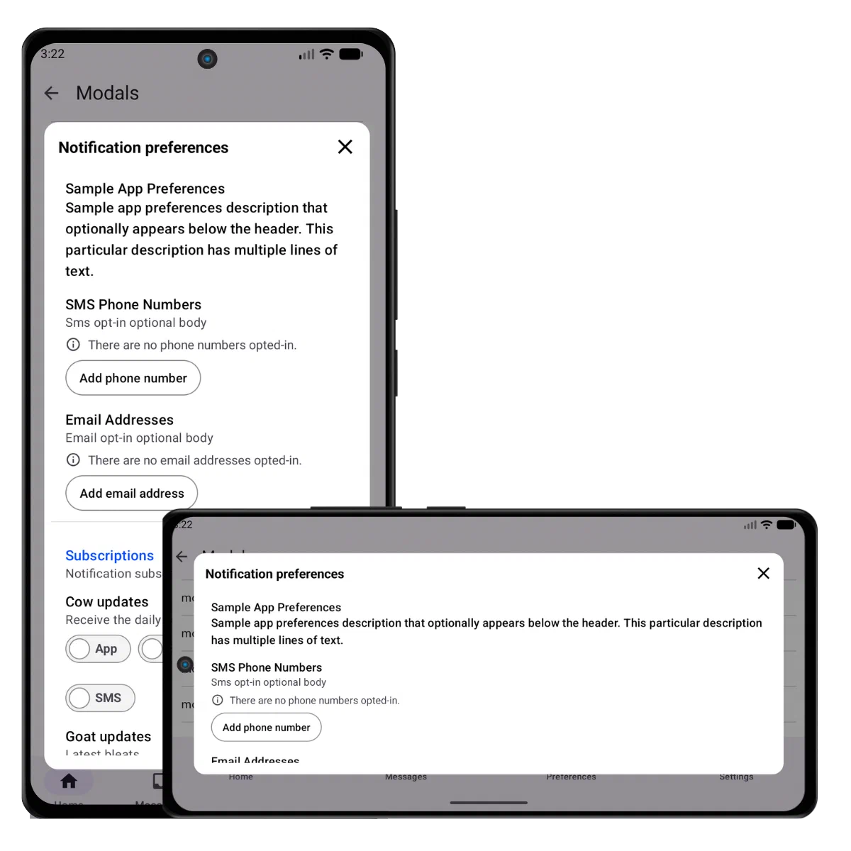
*Preference Center Custom View in a Scene on Android*
# In-App Automation
> In-app messages are fully customizable. Minor modifications can be accomplished by overriding the styles, but more advanced customizations can employ an adapter for the given message type.
In-App Automation (IAA) powers banner, modal, and fullscreen in-app messages.
## Customization
Various options are available for customizing the container view for In-App Automation content via the native SDKs.
Scenes are fully customizable in the dashboard and cannot be customized via the SDK.
## Excluding Activities
Activities can be excluded from auto-displaying an in-app message. This
is useful for preventing in-app message displays on screens where it
would be detrimental to the user experience, such as splash screens,
settings screens, or landing pages.
**Exclude activity from displaying in-app messages**
```xml
```
## Listening for Events
A listener can be added to the in-app messaging manager to listen for when a message
is displayed and finished displaying. This is useful for adding analytics events
outside of Airship as well as for further processing of the in-app message.
#### Kotlin
```kotlin
InAppAutomation.shared().inAppMessaging.displayDelegate = object : InAppMessageDisplayDelegate {
override fun isMessageReadyToDisplay(message: InAppMessage, scheduleId: String): Boolean {
// Called to check if the message is ready to be displayed
return true
}
override fun messageWillDisplay(message: InAppMessage, scheduleId: String) {
// Message displayed
}
override fun messageFinishedDisplaying(message: InAppMessage, scheduleId: String) {
// Message finished
}
}
```
#### Java
```java
InAppAutomation.shared().getInAppMessaging().setDisplayDelegate(new InAppMessageDisplayDelegate() {
@Override
public boolean isMessageReadyToDisplay(@NonNull InAppMessage message, @NonNull String scheduleId) {
// Called to check if the message is ready to be displayed
return true;
}
@Override
public void messageWillDisplay(@NonNull InAppMessage message, @NonNull String scheduleId) {
// Message displayed
}
@Override
public void messageFinishedDisplaying(@NonNull InAppMessage message, @NonNull String scheduleId) {
// Message finished
}
});
```
## Fonts
Fonts that are added in XML are available for use with in-app messaging, including
downloadable fonts. To add fonts, please read the [Fonts In XML guide](https://developer.android.com/develop/ui/views/text-and-emoji/fonts-in-xml).
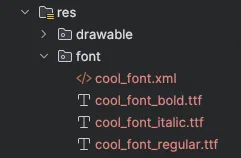
*Android Custom Font*
After adding fonts to your app, create a Font Stack in the Airship dashboard by following the steps in [Setting brand guidelines](https://www.airship.com/docs/guides/messaging/features/brand-guidelines/). Then you can select the stack when [setting in-app message defaults](https://www.airship.com/docs/guides/messaging/in-app-experiences/configuration/defaults/) and creating in-app messages.
## Styles
The Android resource merging feature can be used to override any of the message
styles that the SDK provides. Copy any of the styles that need to be overridden
into the application's resource directory, then change any of the styles.
Styles:
- [Banner](https://github.com/urbanairship/android-library/blob/main/urbanairship-automation/src/main/res/values/style_iam_banner.xml)
- [Fullscreen](https://github.com/urbanairship/android-library/blob/main/urbanairship-automation/src/main/res/values/style_iam_fullscreen.xml)
- [Modal](https://github.com/urbanairship/android-library/blob/main/urbanairship-automation/src/main/res/values/style_iam_modal.xml)
- [HTML](https://github.com/urbanairship/android-library/blob/main/urbanairship-automation/src/main/res/values/style_iam_html.xml)
## Custom Adapters
Providing an adapter allows full customization for any message type. The adapter
will be created by the in-app messaging manager when a message's schedule is triggered.
Once created, the adapter will be called to first prepare the in-app message, giving
the adapter time to download any resources such as images. After the adapter prepares
the message, the adapter will be called to display the message. Be sure to update the adapter factory for
the message type you are trying to override. In this example, the adapter is overriding modal messages,
therefore the custom display adapter type is `CustomDisplayAdapterType.MODAL`.
After the message is displayed, the provided display handler must be notified that the message is finished displaying
by returning a `CustomDisplayResolution` via the suspending method or callback. This will allow other in-app messages
to be displayed.
#### Kotlin
```kotlin
class MyCustomDisplayAdapter(
private val context: Context,
private val message: InAppMessage,
private val assets: AirshipCachedAssets,
private val scope: CoroutineScope
) : CustomDisplayAdapter.SuspendingAdapter {
// Implement the isReady property, used to signal when the adapter is ready to display the message.
// If this adapter does not need to wait for anything before displaying the message, you can return
// an initial value of true to indicate that it is always ready. Otherwise, set the initial value
// to false, and emit true once the adapter is ready to display the message.
override val isReady: StateFlow = MutableStateFlow(true)
override fun display(context: Context): CustomDisplayResolution {
// Display the message...
return CustomDisplayResolution.UserDismissed
}
companion object {
fun register(scope: CoroutineScope) {
InAppAutomation.shared().inAppMessaging.setAdapterFactoryBlock(
type = CustomDisplayAdapterType.MODAL,
factoryBlock = { context, message, assets ->
MyCustomDisplayAdapter(context, message, assets, scope)
}
)
}
}
}
```
#### Java
```java
class MyCustomDisplayAdapter implements CustomDisplayAdapter.CallbackAdapter {
private final InAppMessage message;
public MyCustomDisplayAdapter(
Context context,
InAppMessage message,
AirshipCachedAssets assets
) {
this.message = message;
}
@Override
public void display(@NonNull Context context, DisplayFinishedCallback callback) {
// Display the message...
callback.finished(CustomDisplayResolution.UserDismissed.INSTANCE);
}
static void register() {
InAppAutomation.shared().getInAppMessaging().setAdapterFactoryBlock(
CustomDisplayAdapterType.MODAL,
(context, message, assets) -> new MyCustomDisplayAdapter(context, message, assets)
);
}
}
```
#### Kotlin
```kotlin
MyCustomDisplayAdapter.register()
```
#### Java
```java
MyCustomDisplayAdapter.register();
```
## Standard In-App Messages
Standard [in-app messages](https://www.airship.com/docs/guides/messaging/messages/content/app/in-app-messages/)
delivered through push messages are managed by the legacy in-app message
manager. The manager converts the standard in-app message into a new in-app message
schedule. The conversion can be customized by setting a builder extender to
extend either the schedule builder or the message builder.
#### Kotlin
```kotlin
InAppAutomation.shared().legacyInAppMessaging
.scheduleExtender = { schedule ->
// Return an updated schedule
schedule.newBuilder()
.setPriority(10)
.setLimit(3)
.build()
}
```
#### Java
```java
InAppAutomation.shared().getLegacyInAppMessaging()
.setScheduleExtender((schedule) ->
// Return an updated schedule
schedule.newBuilder()
.setPriority(10)
.setLimit(3)
.build()
);
```
#### Kotlin
```kotlin
InAppAutomation.shared().legacyInAppMessaging
.messageExtender = { message ->
val extras = JsonMap.newBuilder()
.putAll(message.getExtras())
.put("custom_key", "custom_value")
.build()
// Return an updated message
message.newBuilder()
.setExtras(extras)
.build()
}
```
#### Java
```java
InAppAutomation.shared().getLegacyInAppMessaging()
.setMessageExtender(message -> {
JsonMap extras = JsonMap.newBuilder()
.putAll(message.getExtras())
.put("custom_key", "custom_value")
.build();
// Return an updated message
return message.newBuilder()
.setExtras(extras)
.build();
});
```
## Customizing HTML In-App Messages
> **Note:** In order for the Airship JavaScript interface to be loaded into the webview, the URL must be specified in the [UrlAllowList](https://www.airship.com/docs/developer/sdk-integration/android/installation/getting-started/#configuring-airship).
HTML in-app messages provide a way to display custom content inside a native web view. These types of in-app messages display with a dismiss button built in, but can also be customized to provide their own buttons capable of dismissing the view. Dismissing a view requires calling the dismiss function on the UAirship JavaScript interface with a button resolution object passed in as a parameter. The button resolution object is a JSON object containing information about the interaction type and the button performing the dismissal. It should match the following format:
```javascript
{
"type" : "button_click",
"button_info" : {
"id" : "button identifier",
"label" : {"text" : "foo"}
}
}
```
The button resolution requires each of the key fields shown above. These include:
- `type` — The type key with the value of resolution type `button_click`
- `button_info` — The button info object containing required id and label fields
- `id` — The button identifier
- `label` — Label object containing the required text key
- `text` — The text key with a string value representing the label text
Providing a basic dismiss button in HTML:
```html
```